DC Cider Fest
This was a group project done in collaboration with Bailey George.
The purpose of the project was to come up with an Ad Campaign that would drum up tourism in DC in collaboration with the Metro. We decided to create a Cider and Beer festival that takes place in the Fall.
We wanted the design to have a handmade quality to it. So we mixed and matched typography to emulate working with a mismatched set of woodblock type. We tried to use textures and type that would give off the feeling of an imperfect stamp.
I designed the logo, two woodblock typefaces, the sidewalk ad, the SmarTrip cards, and assisted with the mockups. My teammate spearheaded the rest of the deliverables.
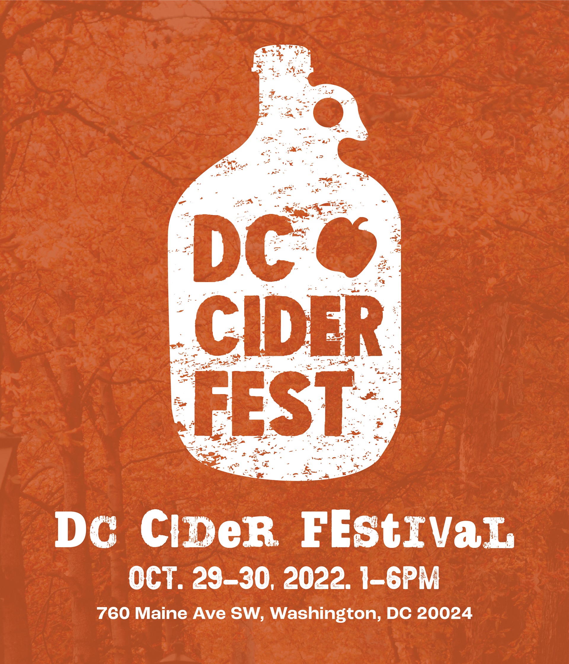
Print Ad
Bus Stop Ad
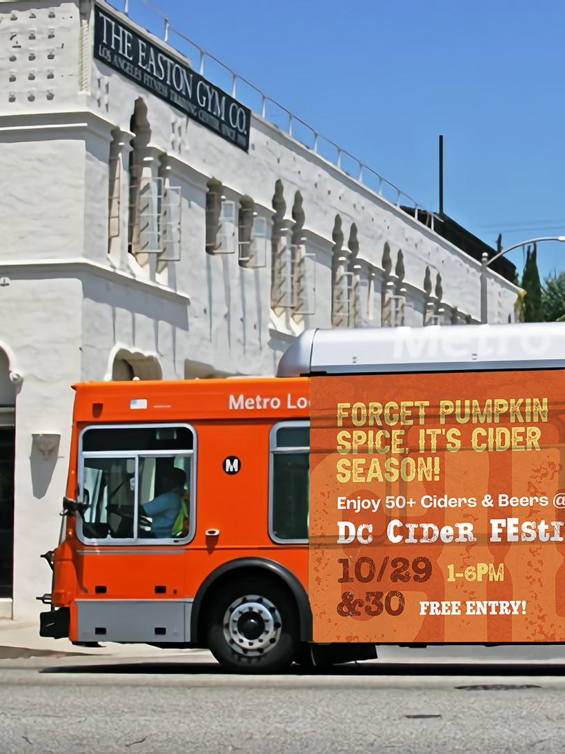
Bus Ad
Sidewalk Decal Ad
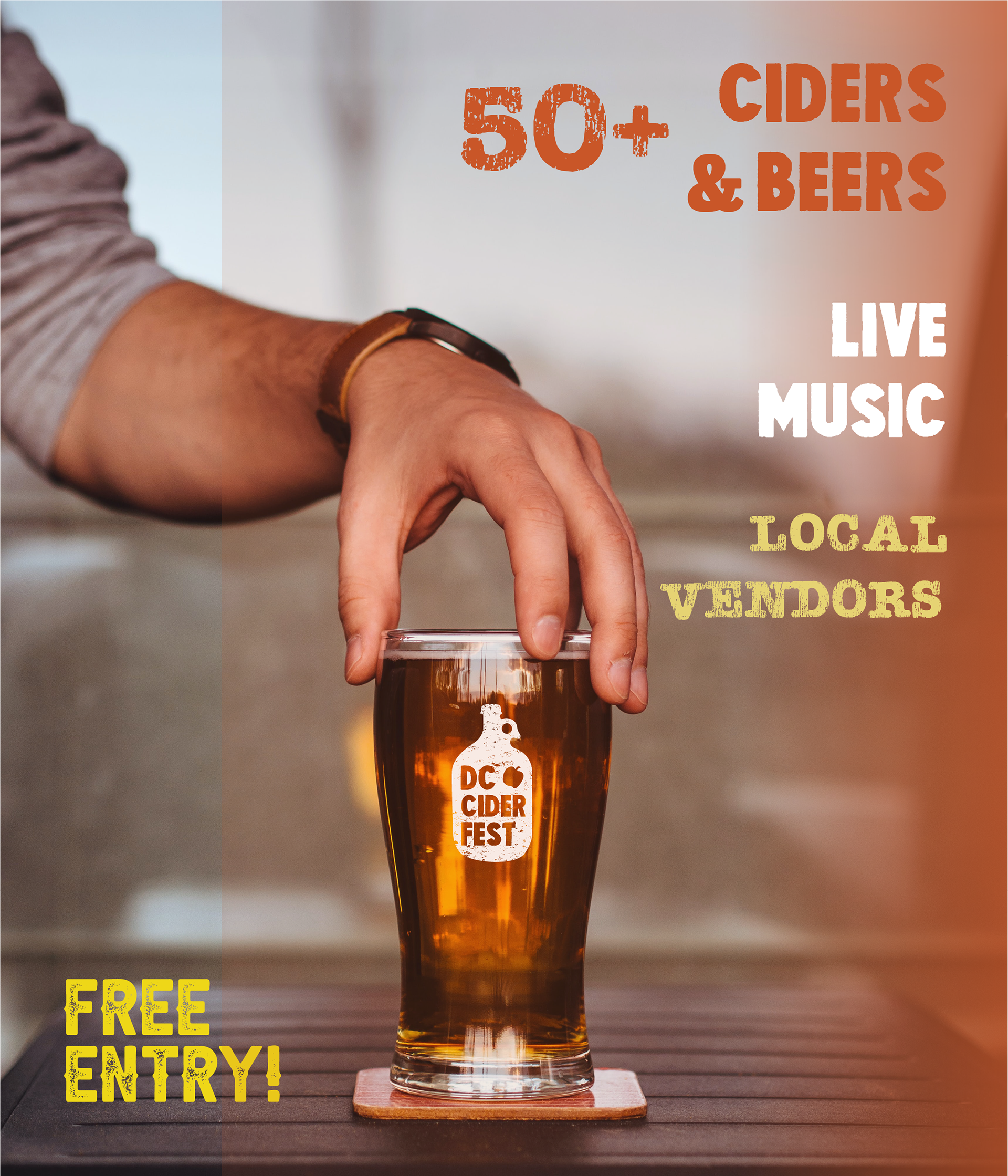
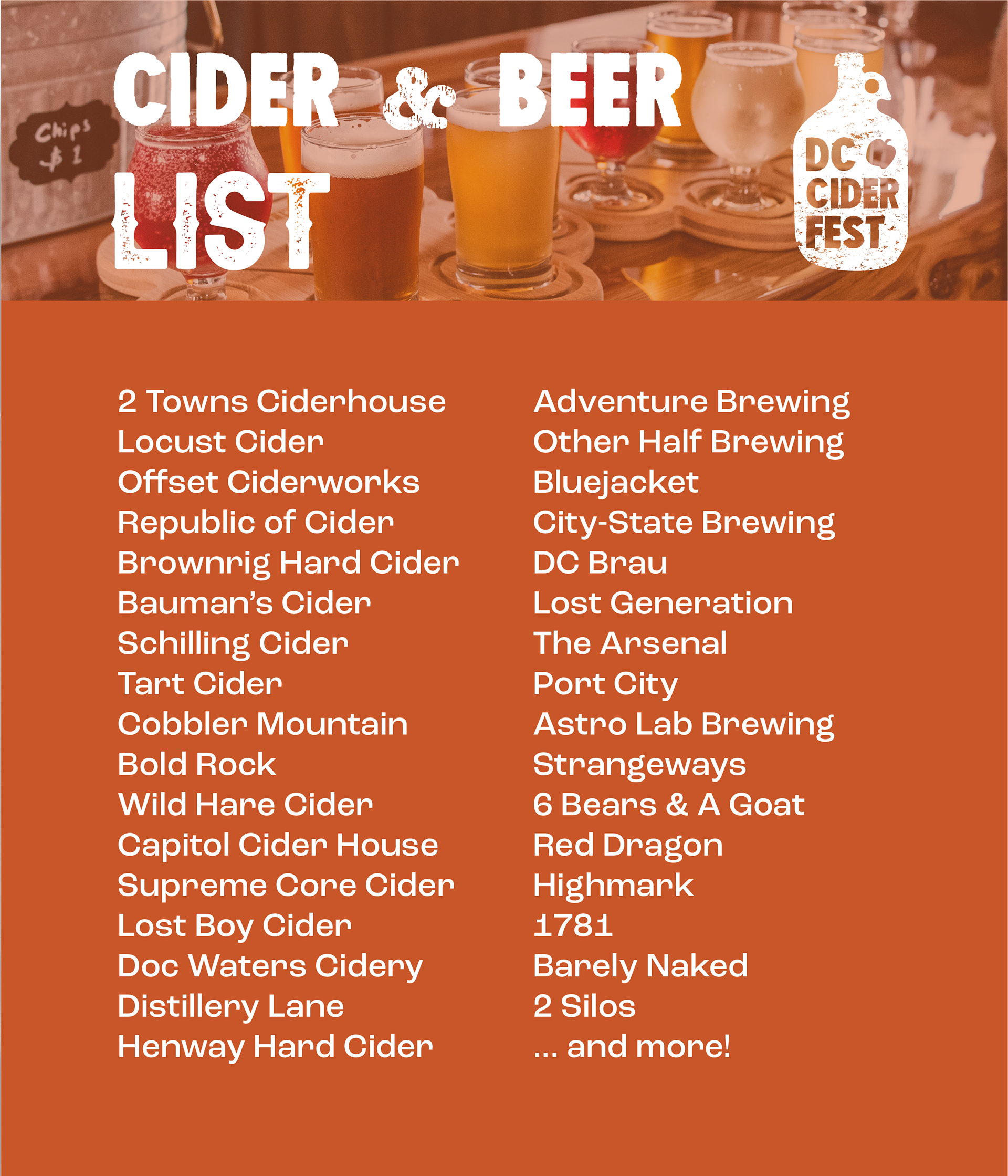
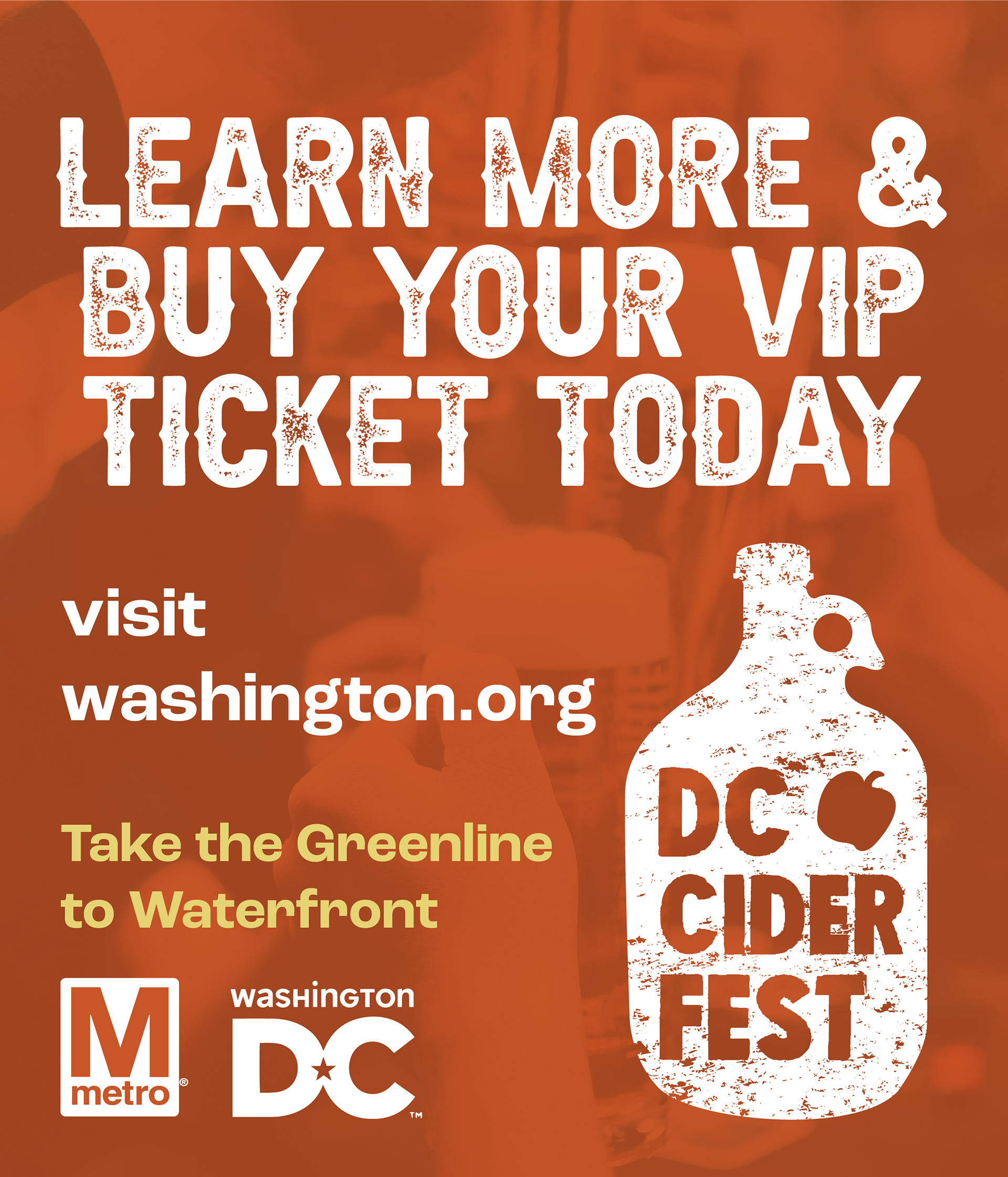
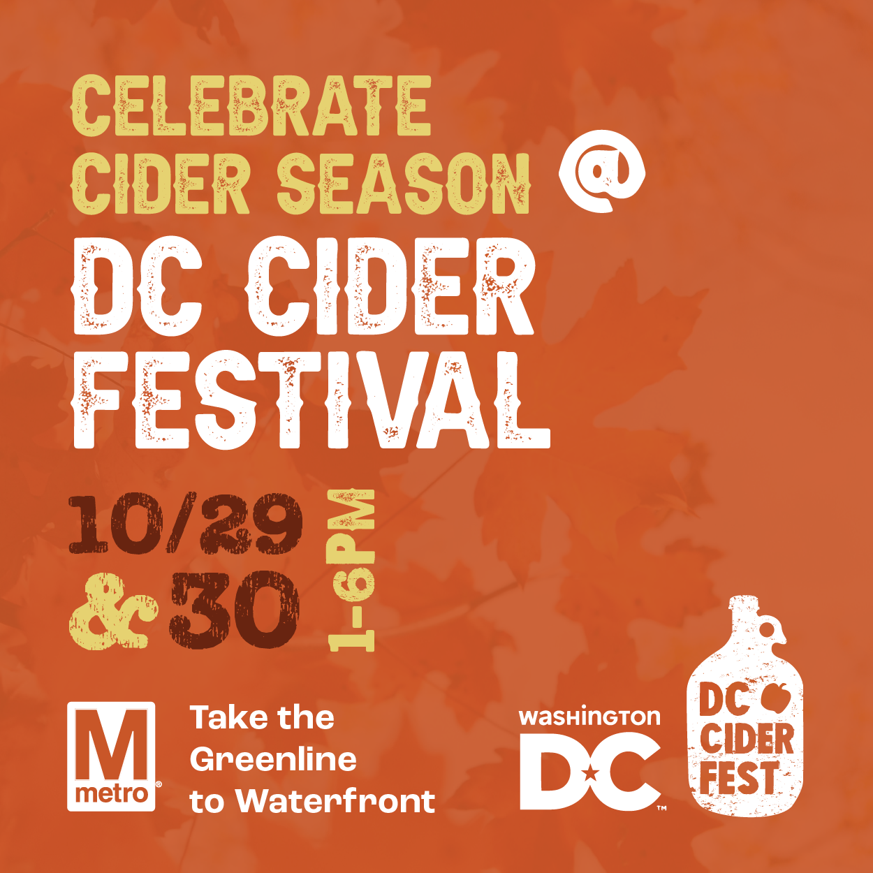
Digital Ads


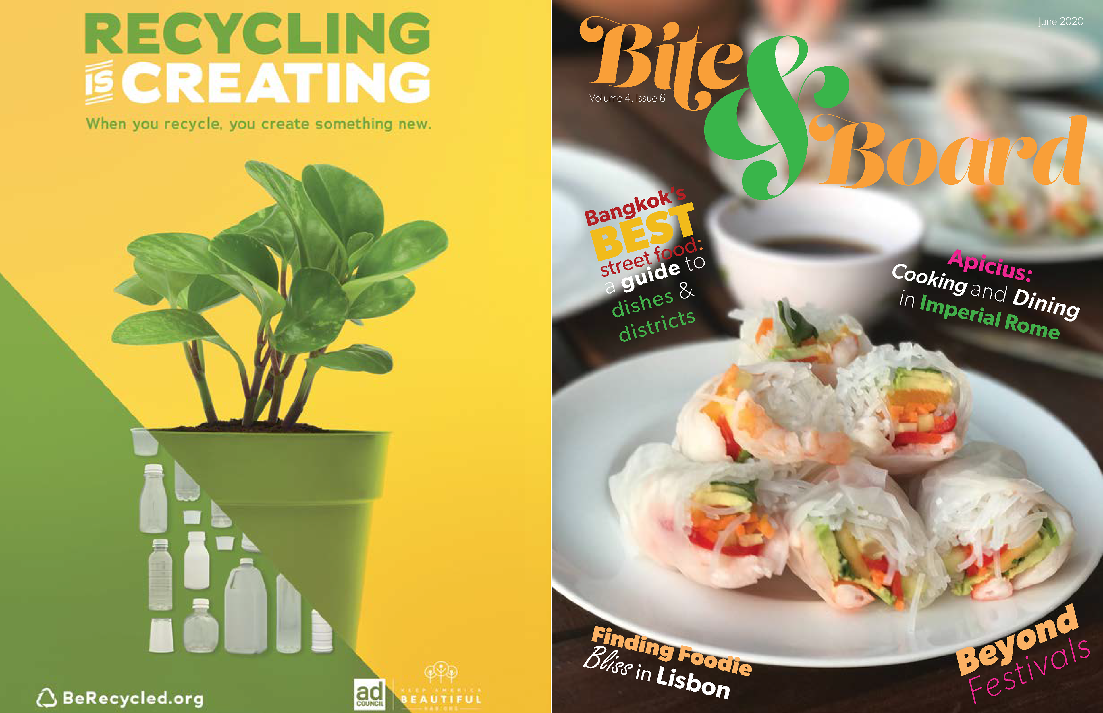
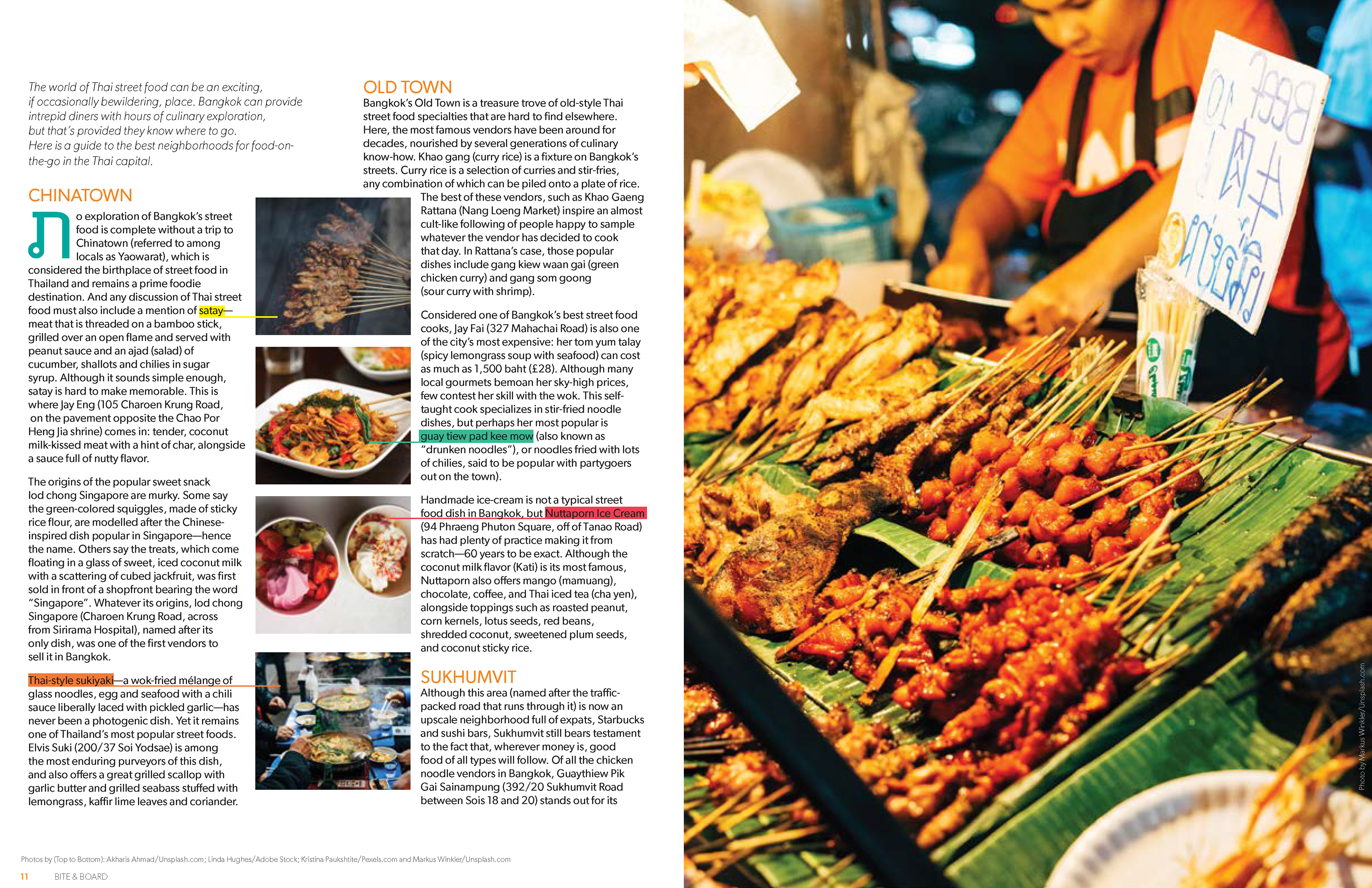
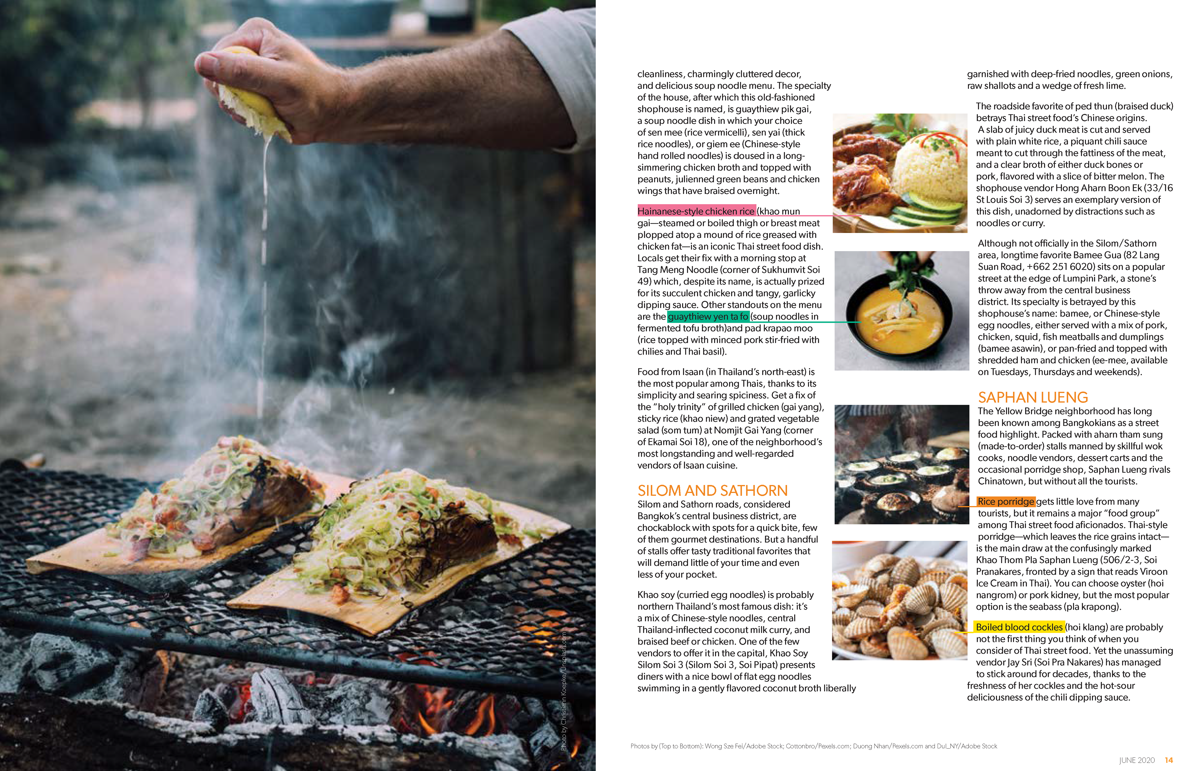
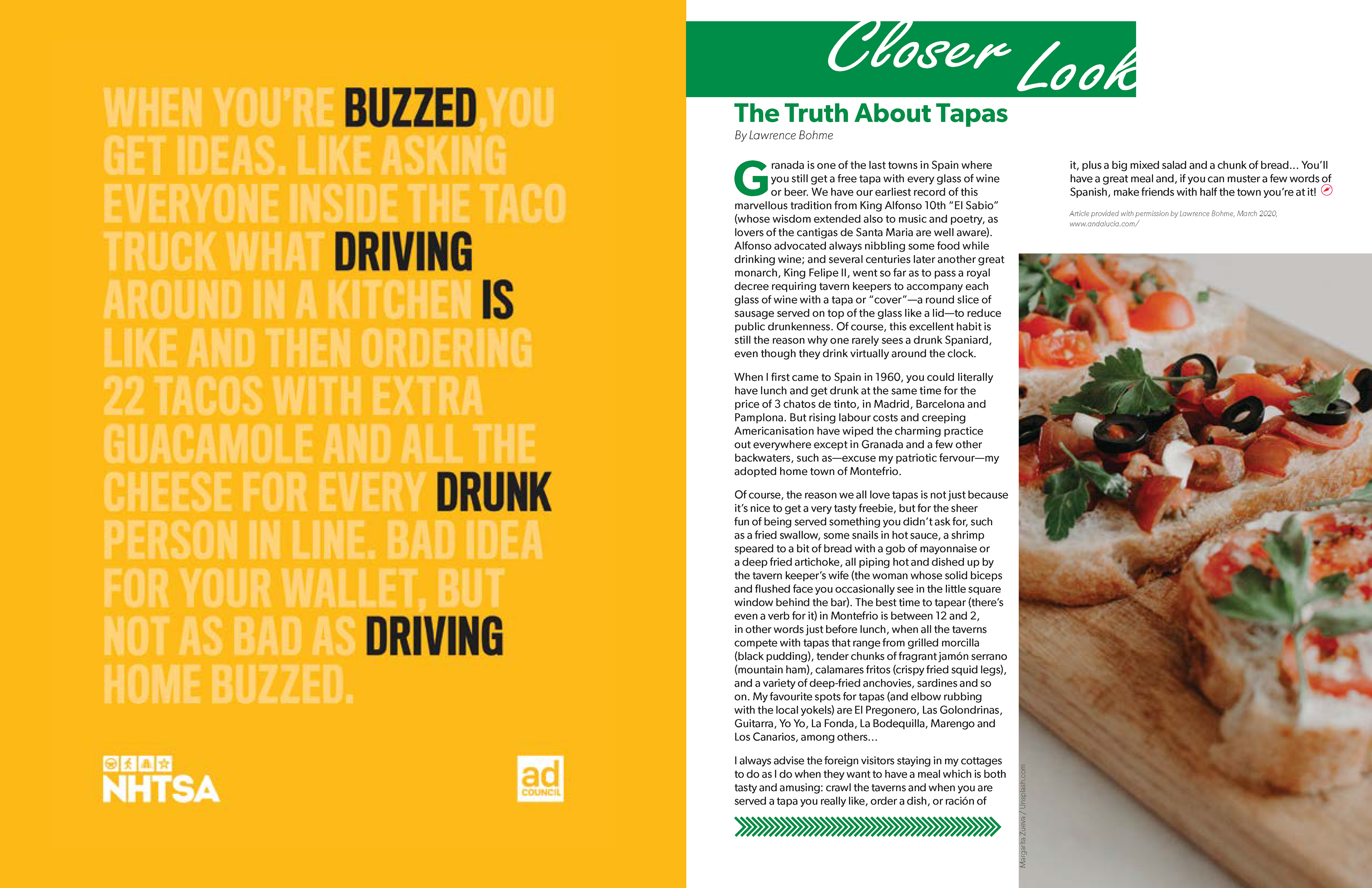
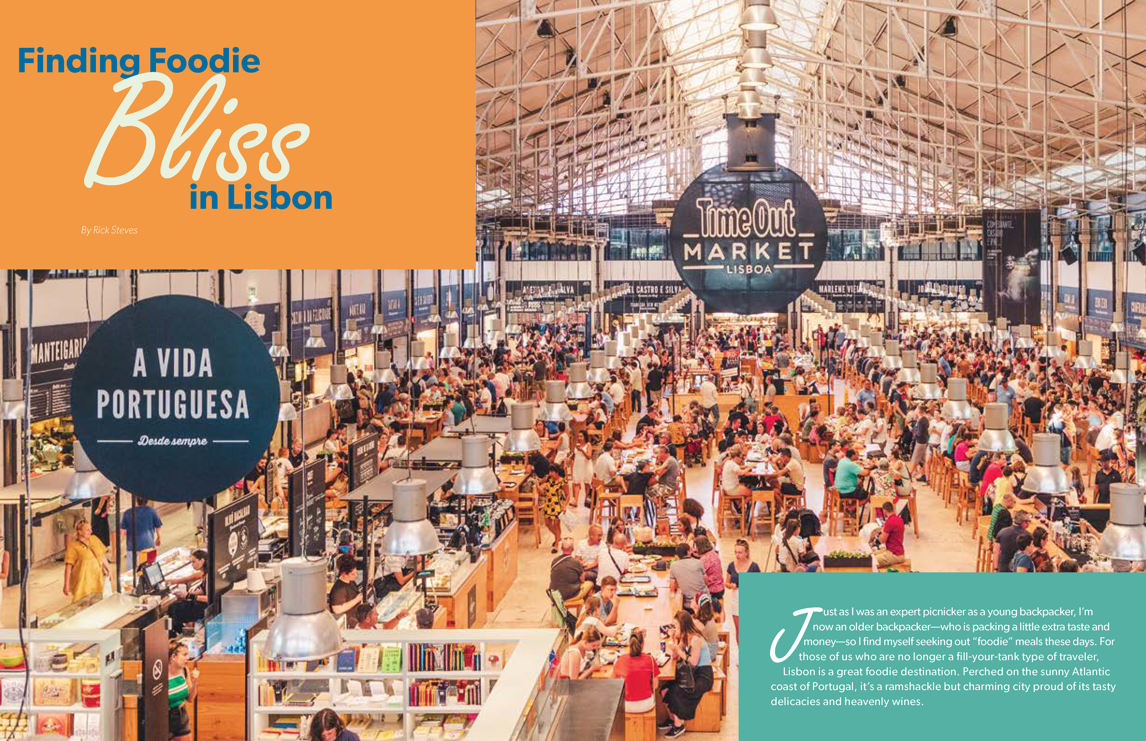
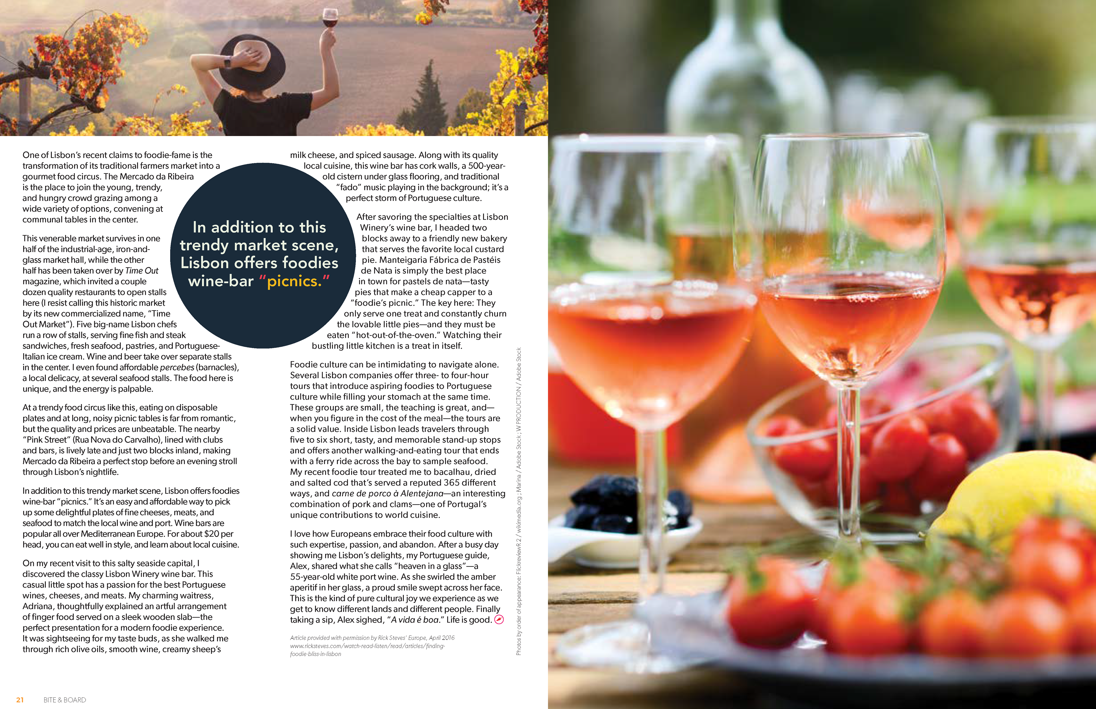
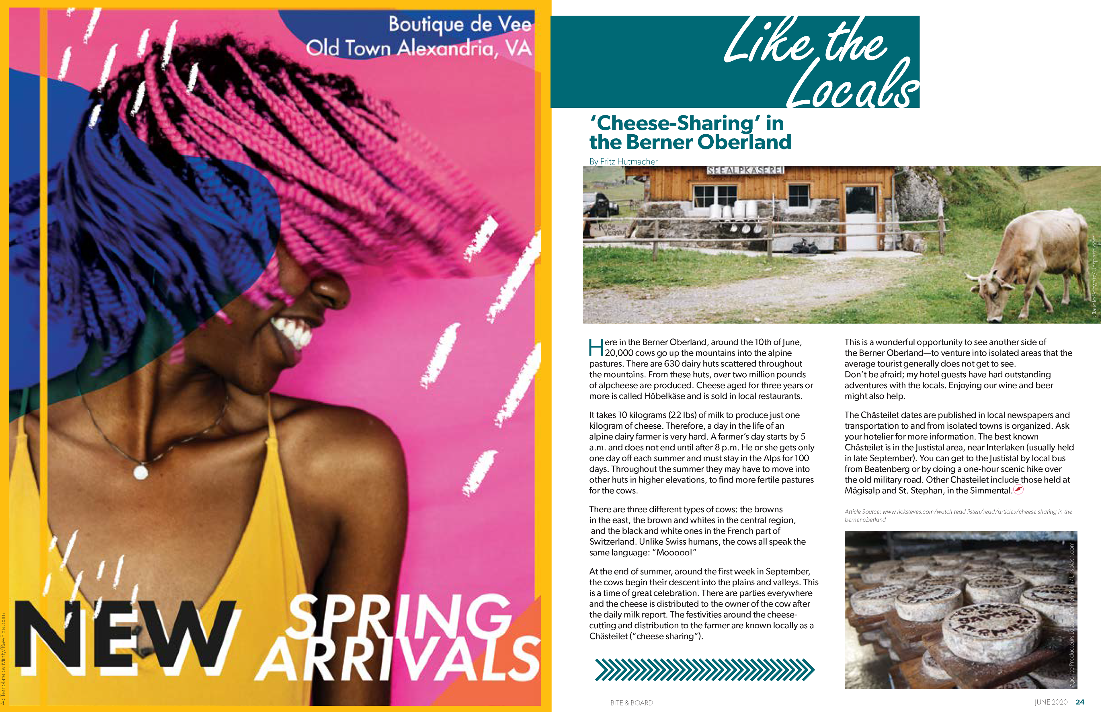
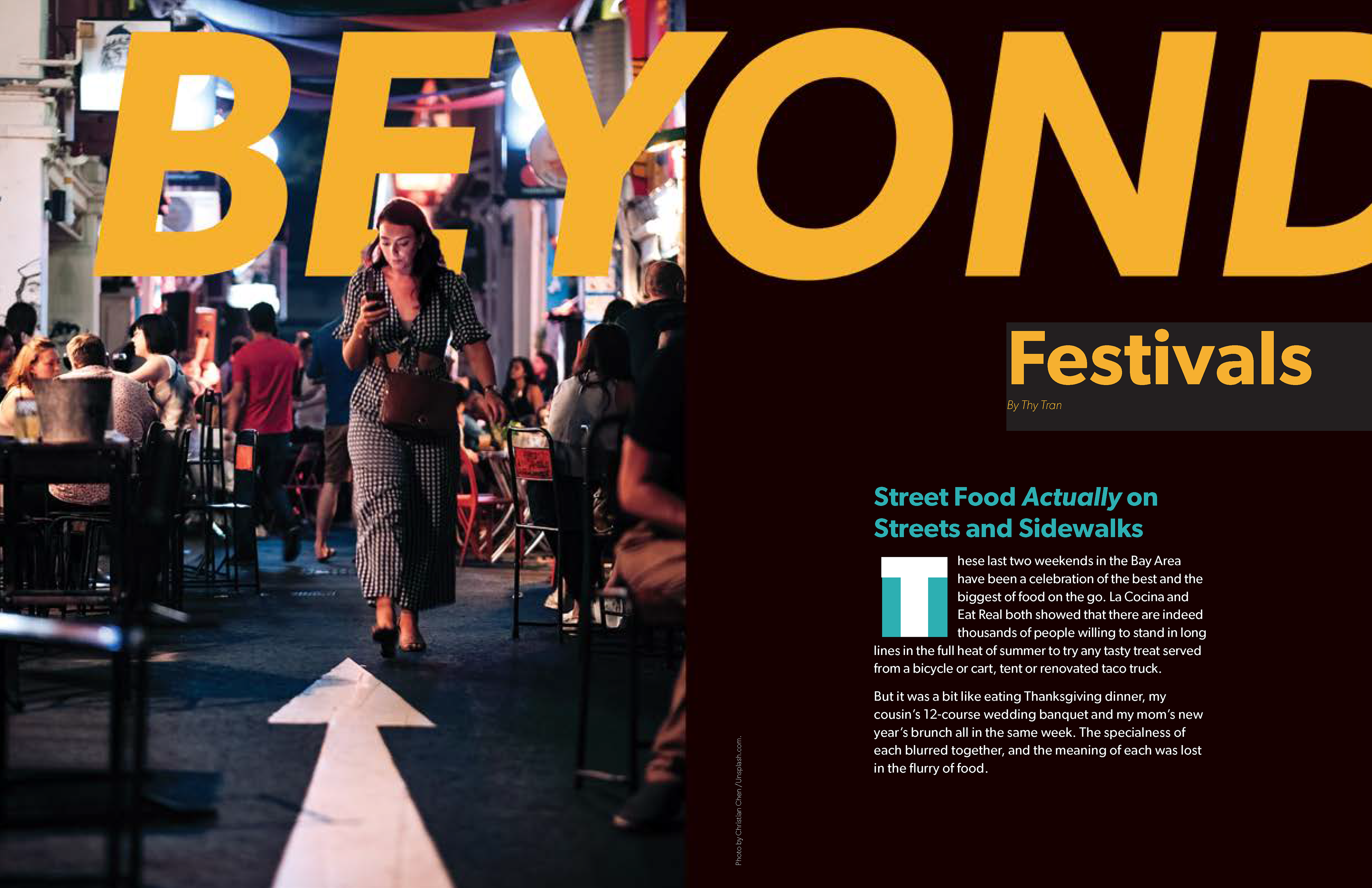
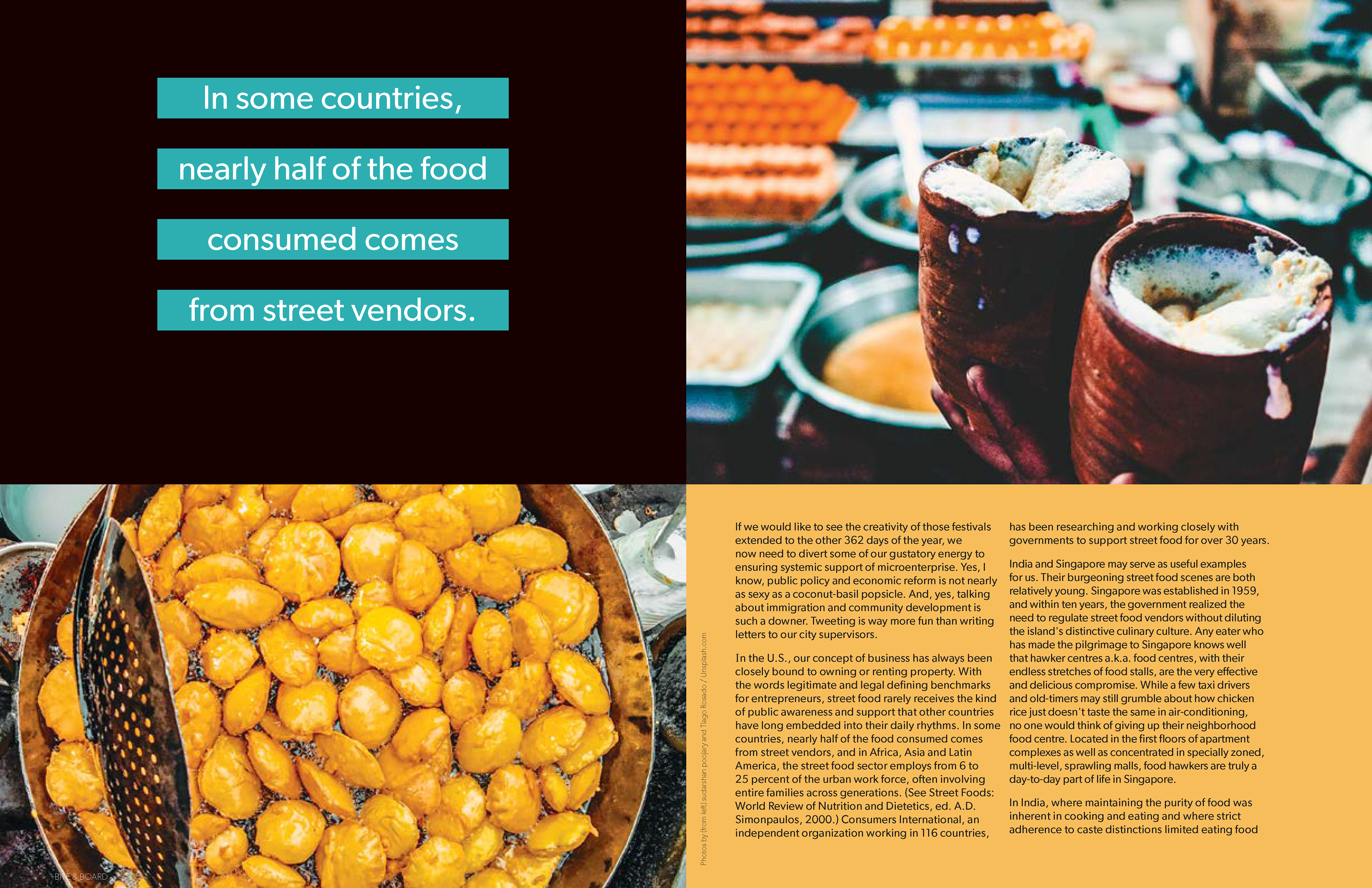
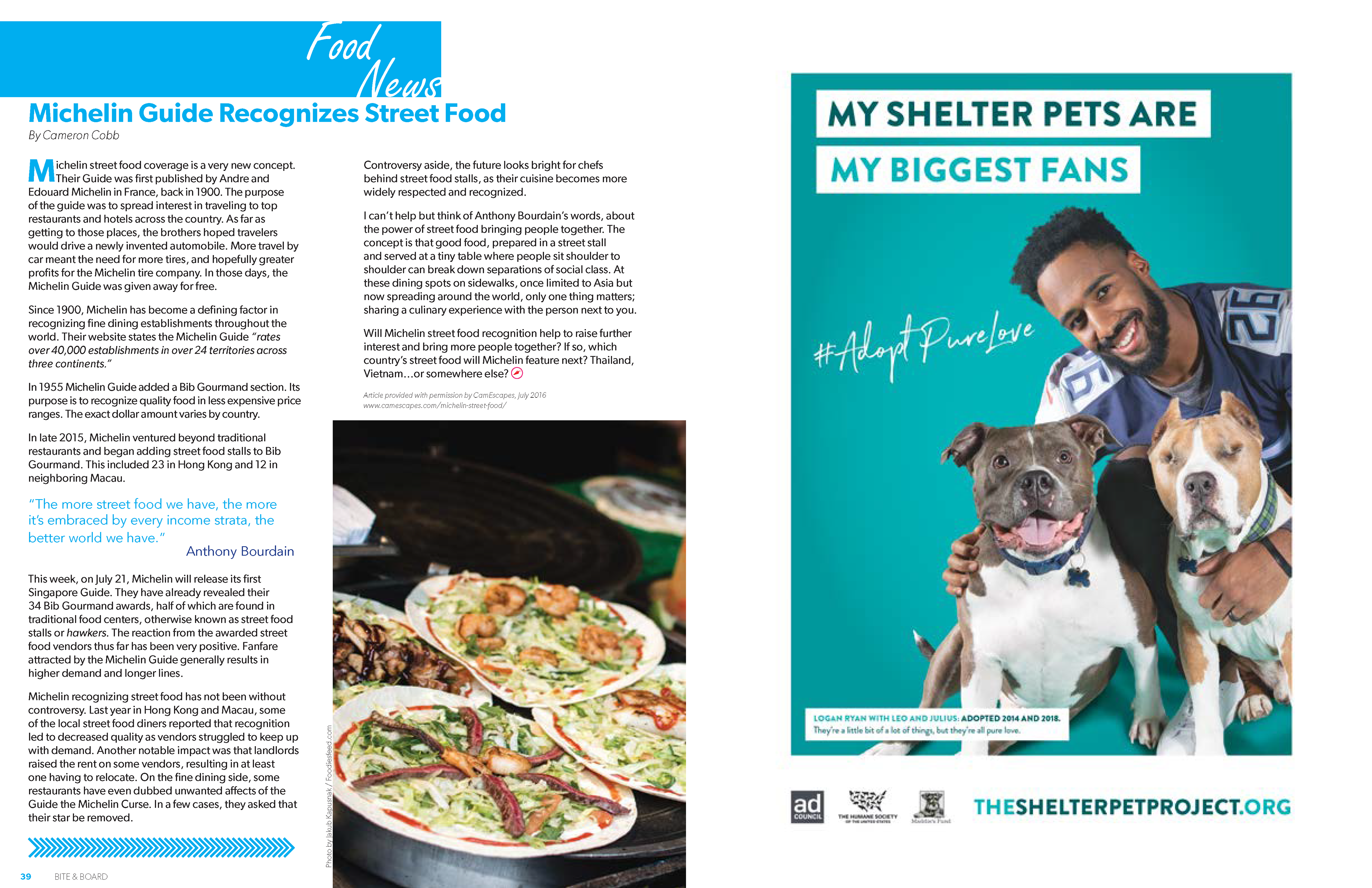
Bite & Board
This project was done in collaboration with:
Norah Dick
Victoria Fraser
Glenn Mahaney
Victoria Fraser
Glenn Mahaney
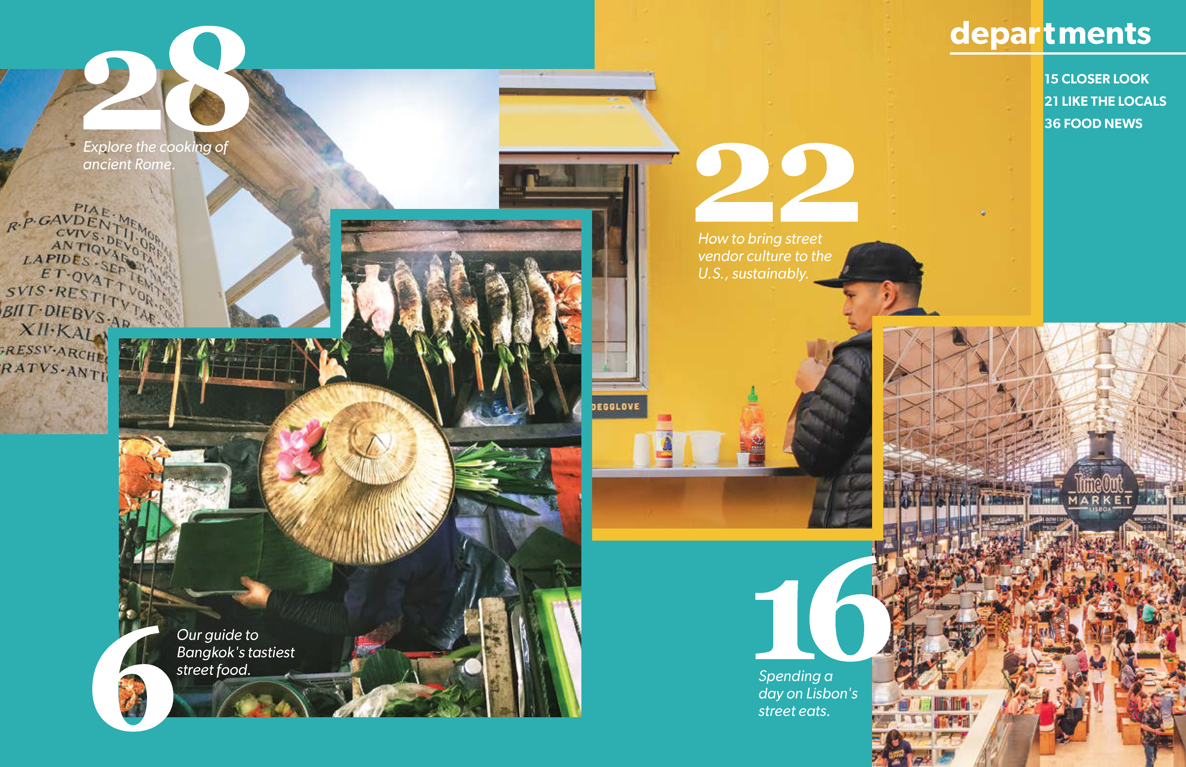
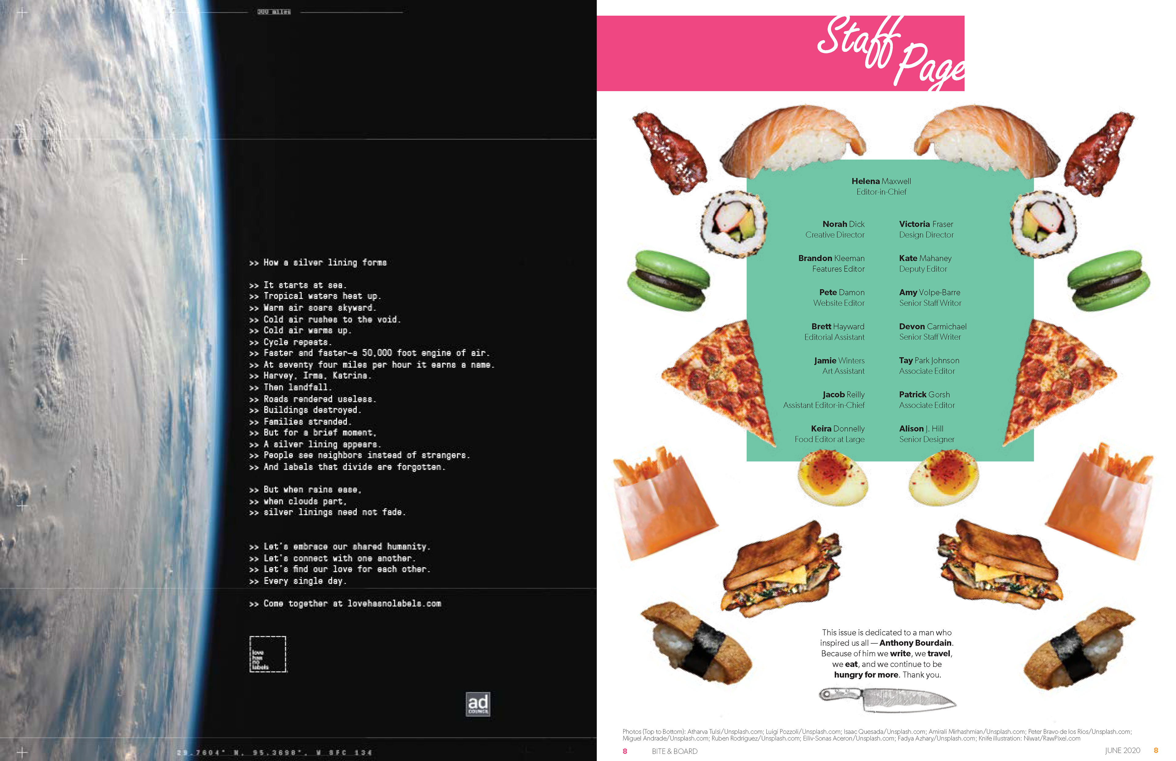
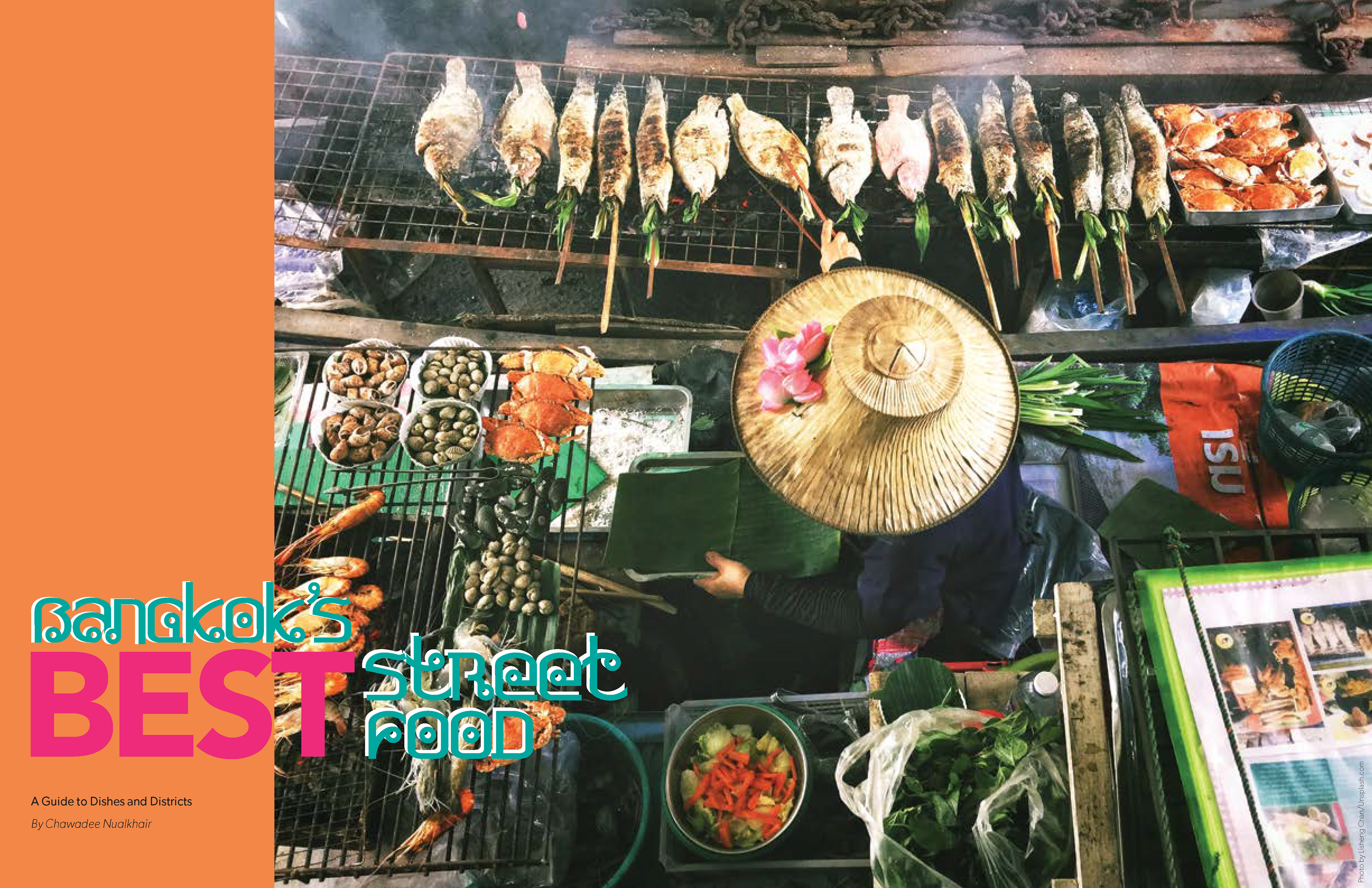
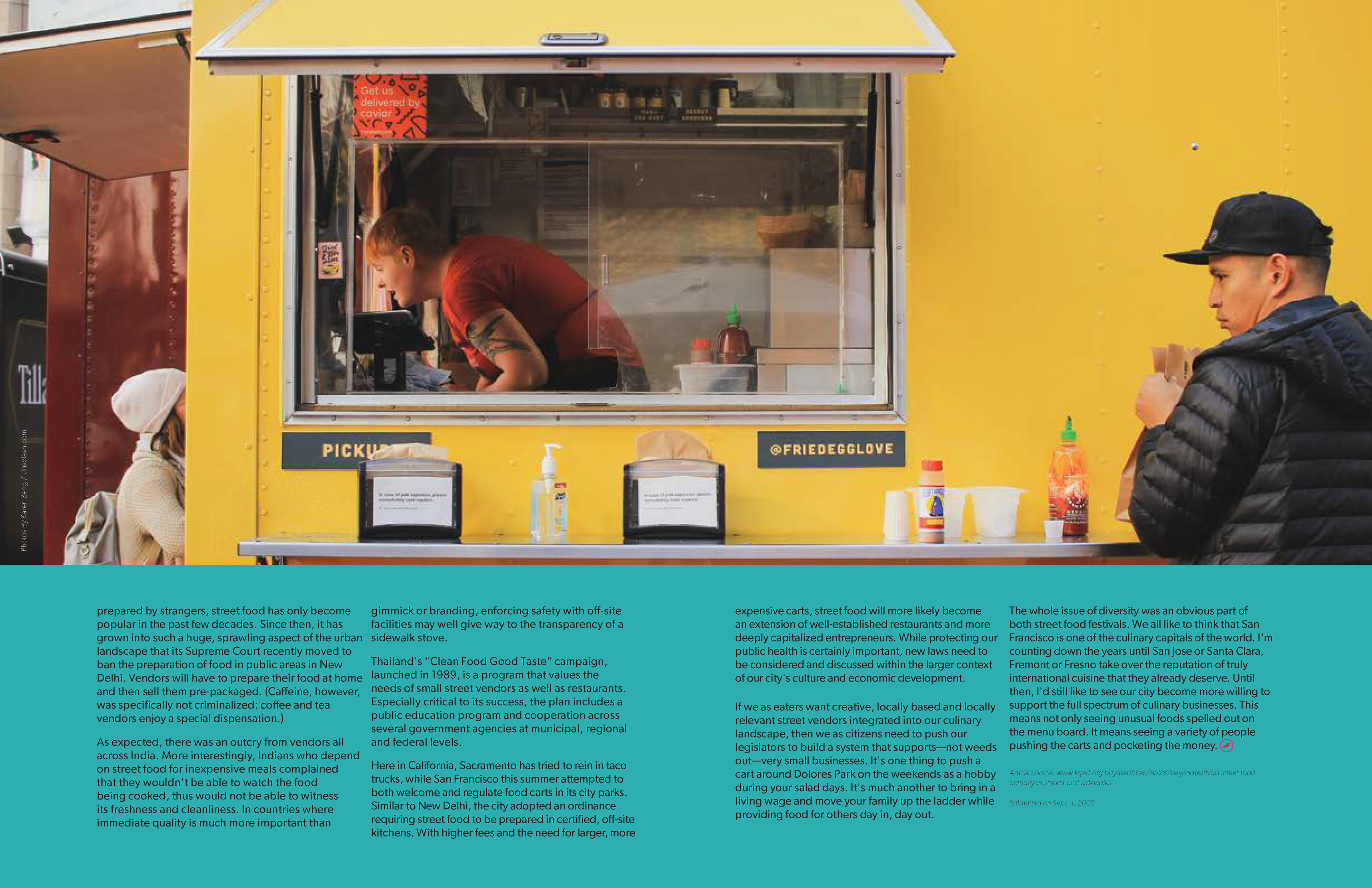
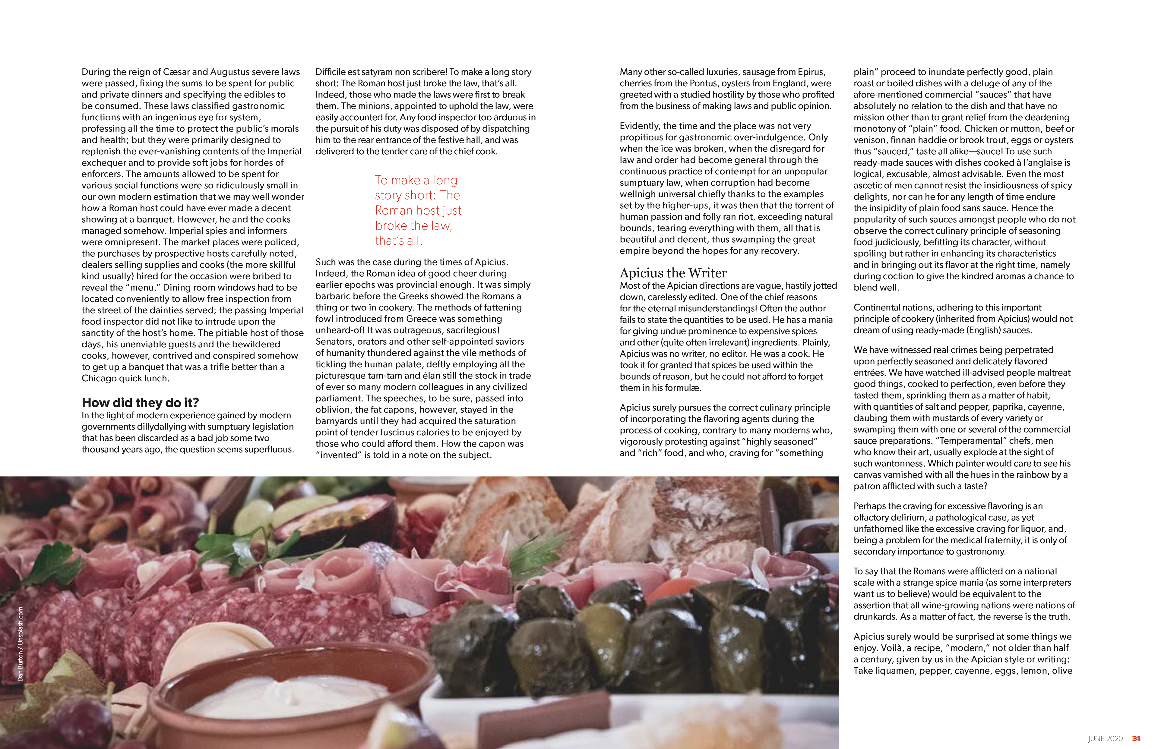
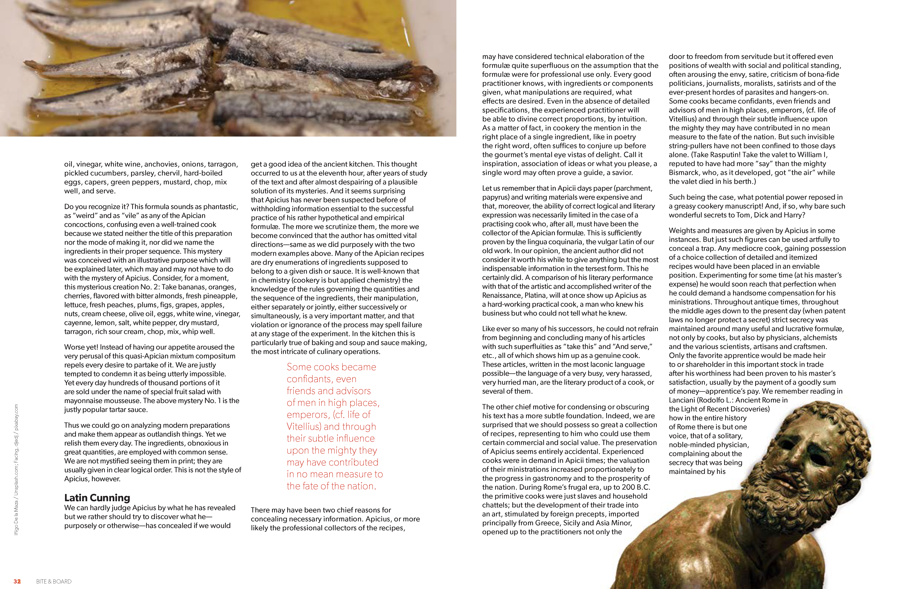
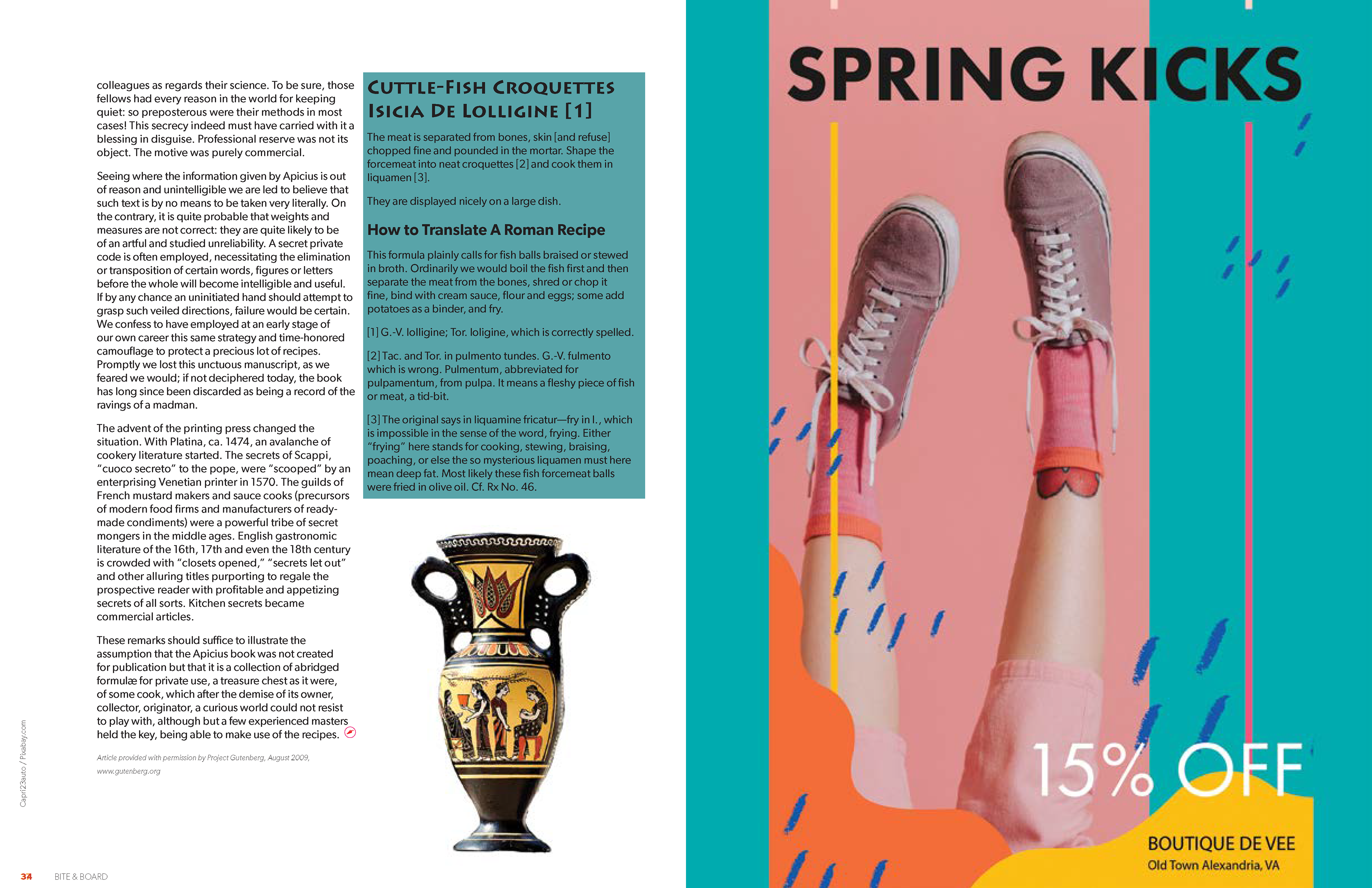
In this project, I was in charge of updating and maintaining unified Style Sheets and Master Pages across the group to keep the typographical identity of the Magazine cohesive.


Bring The Outdoors in

