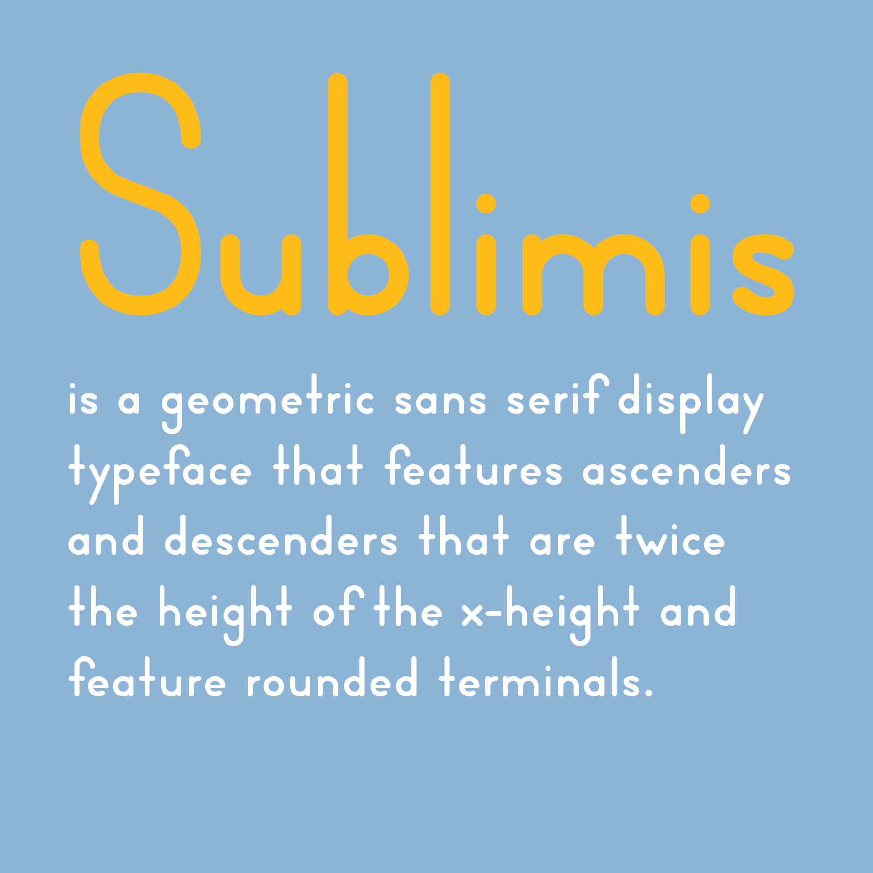
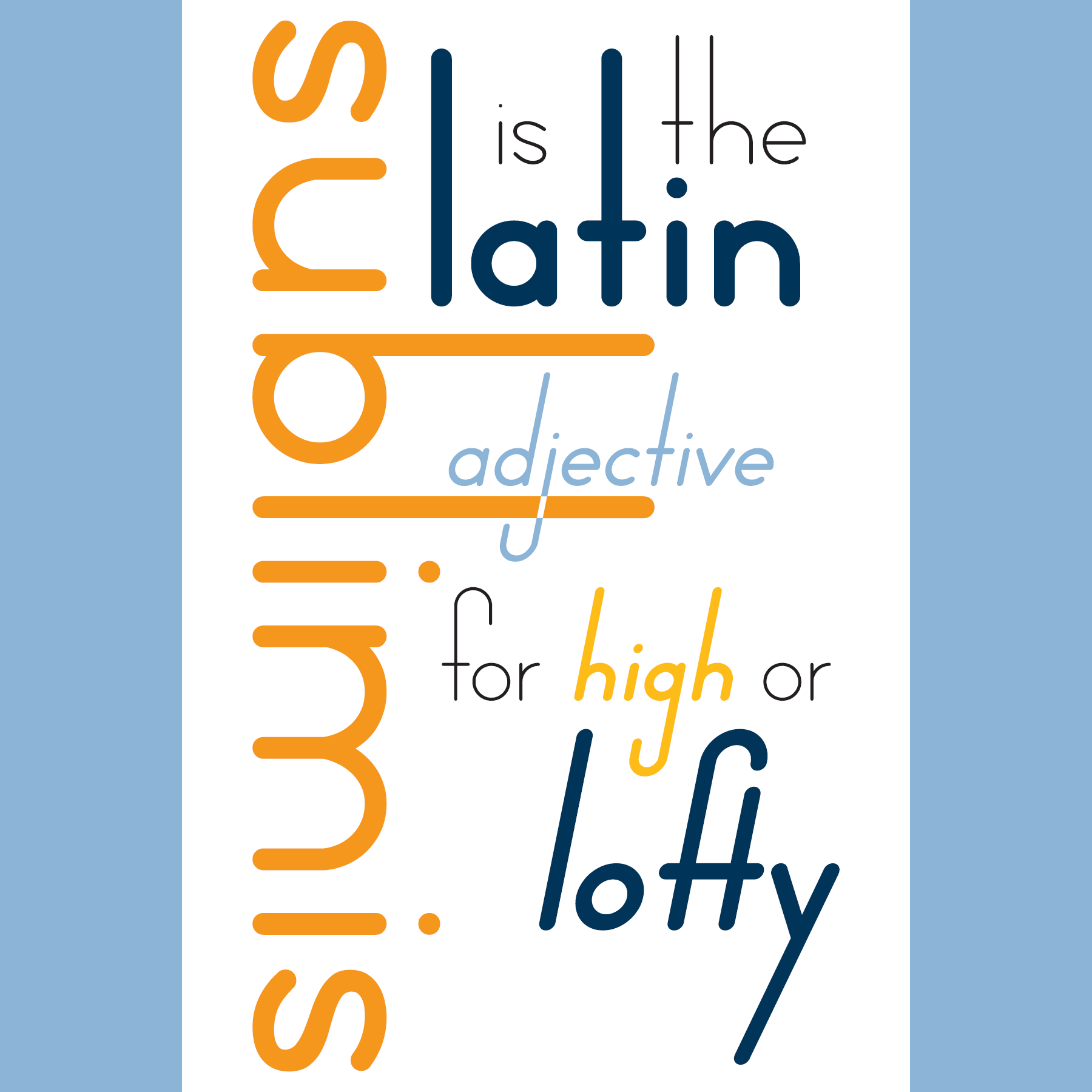
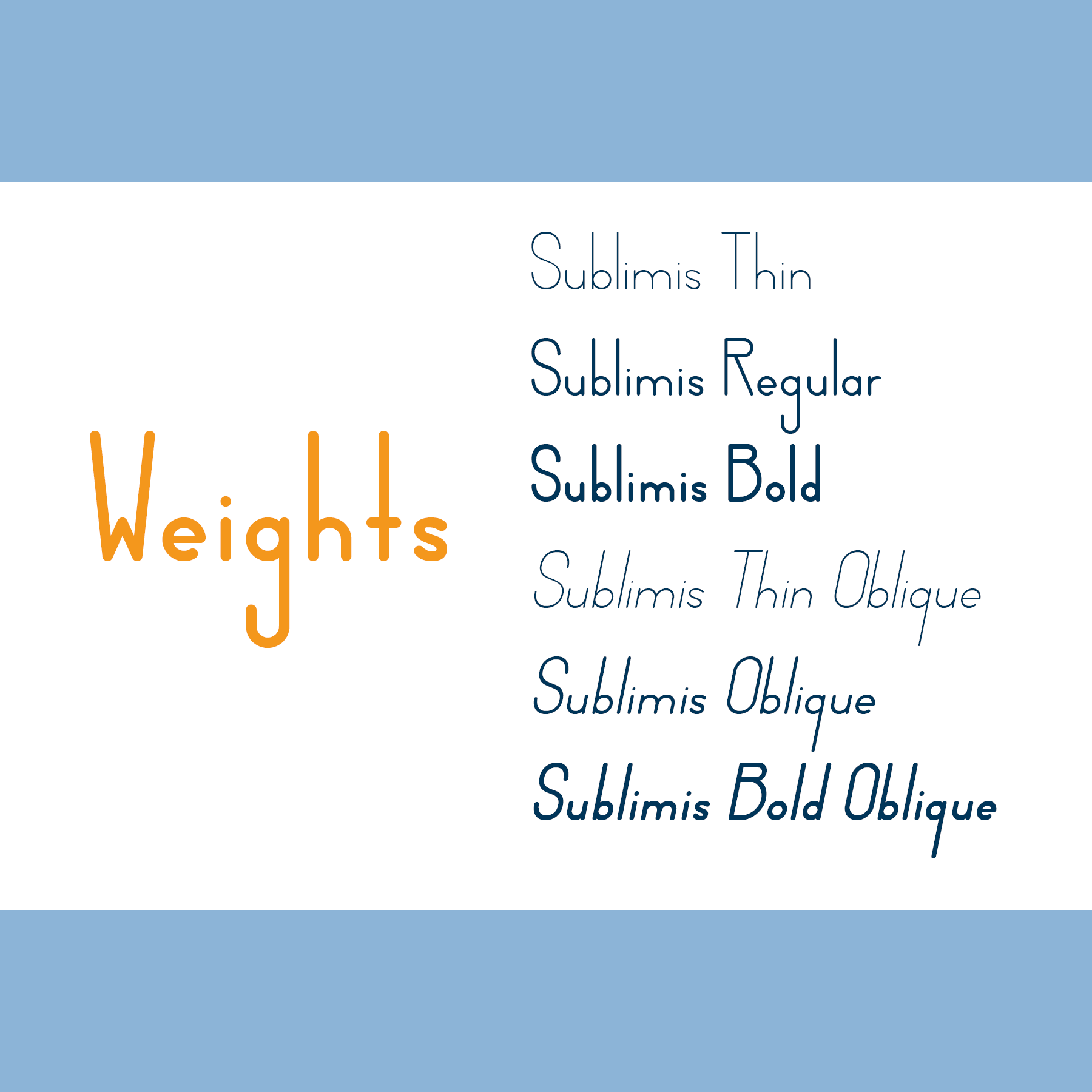
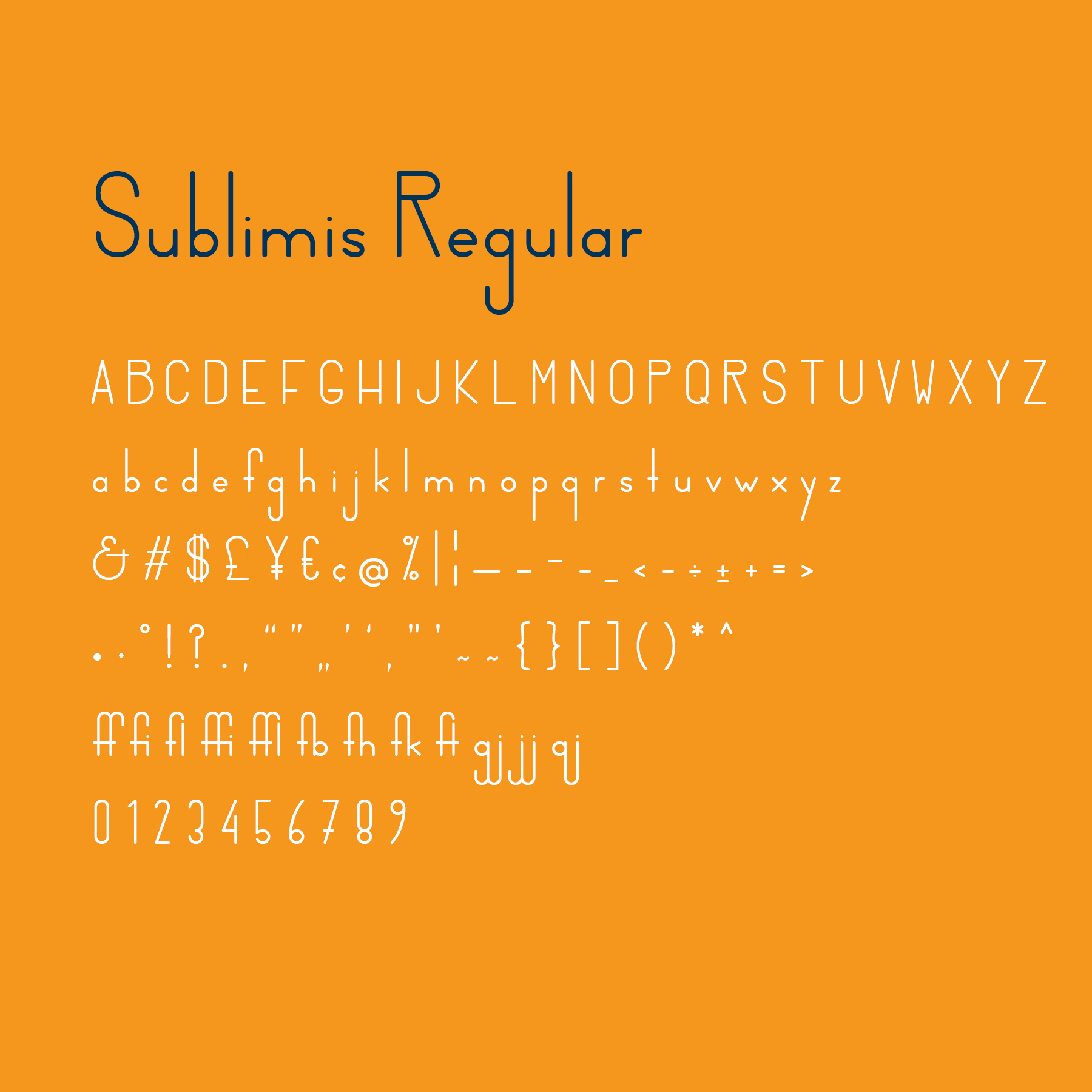
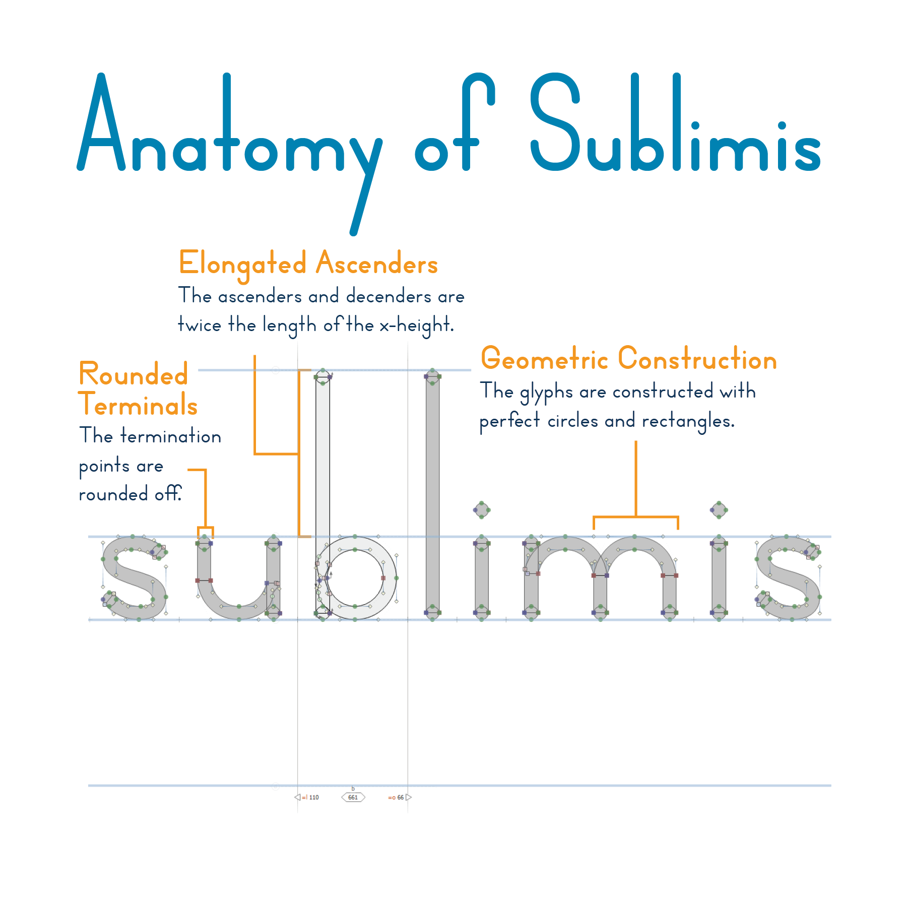
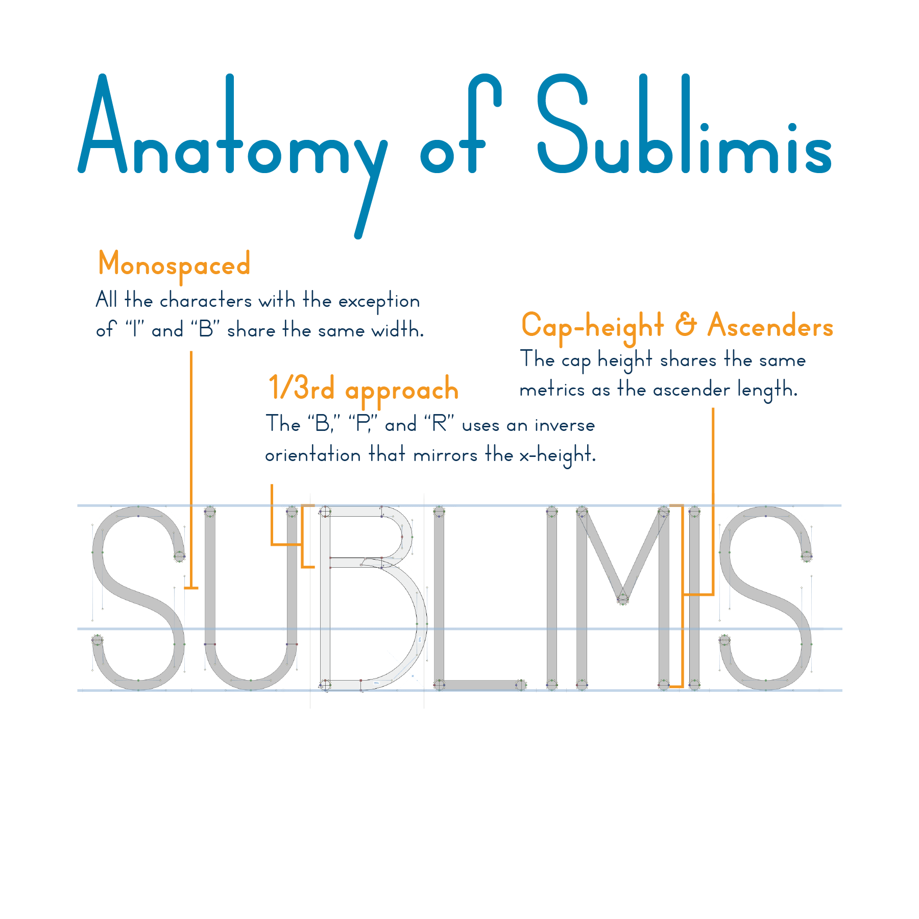
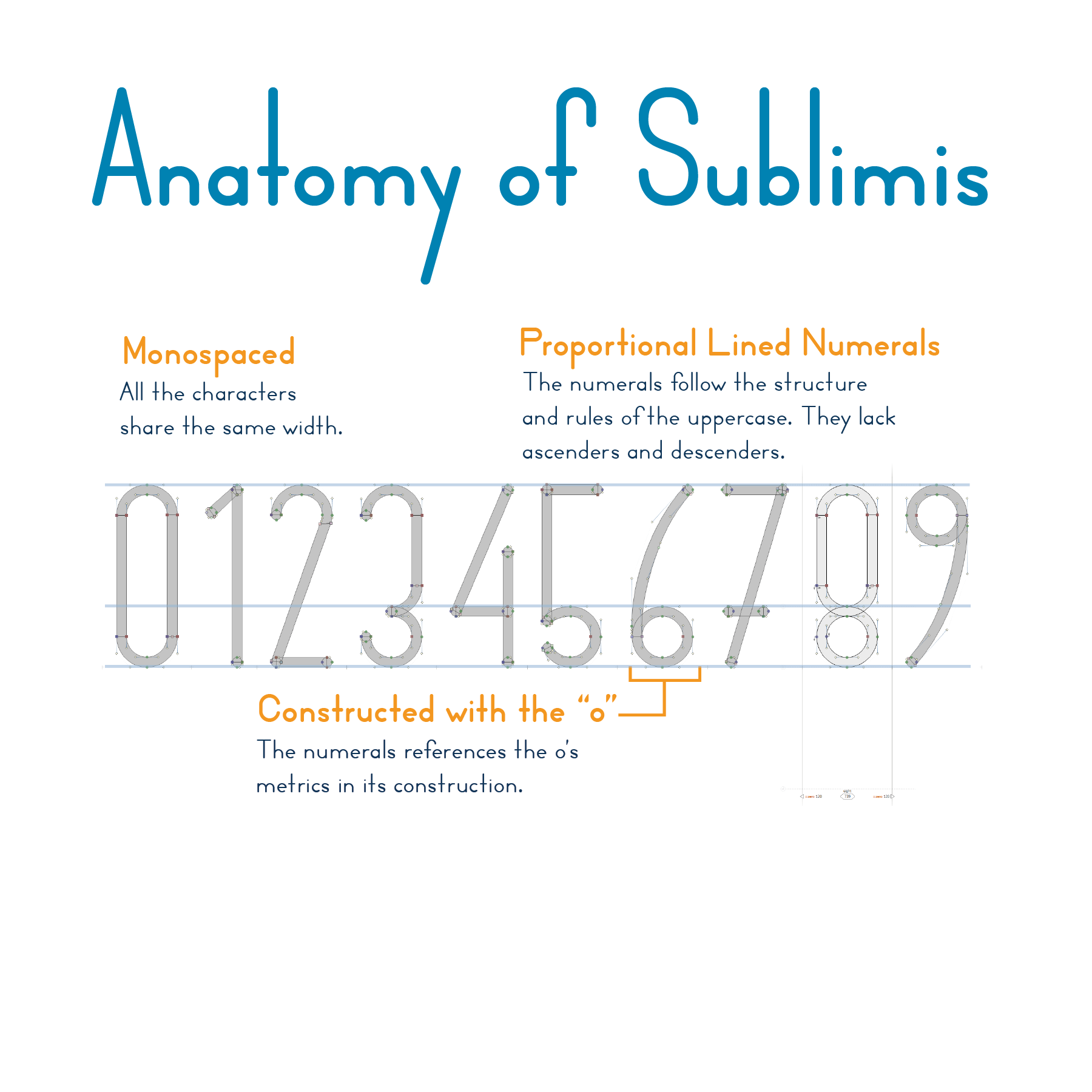
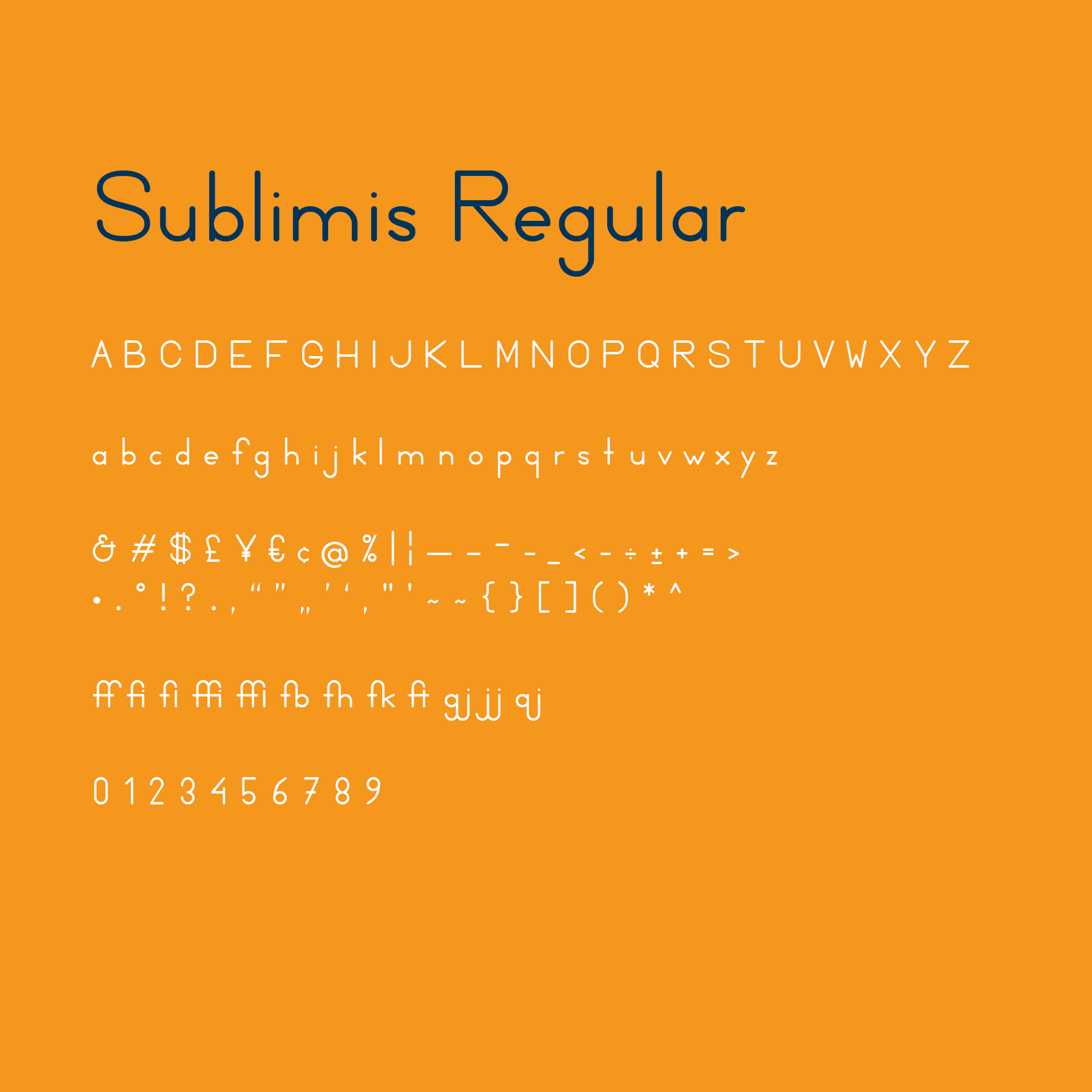
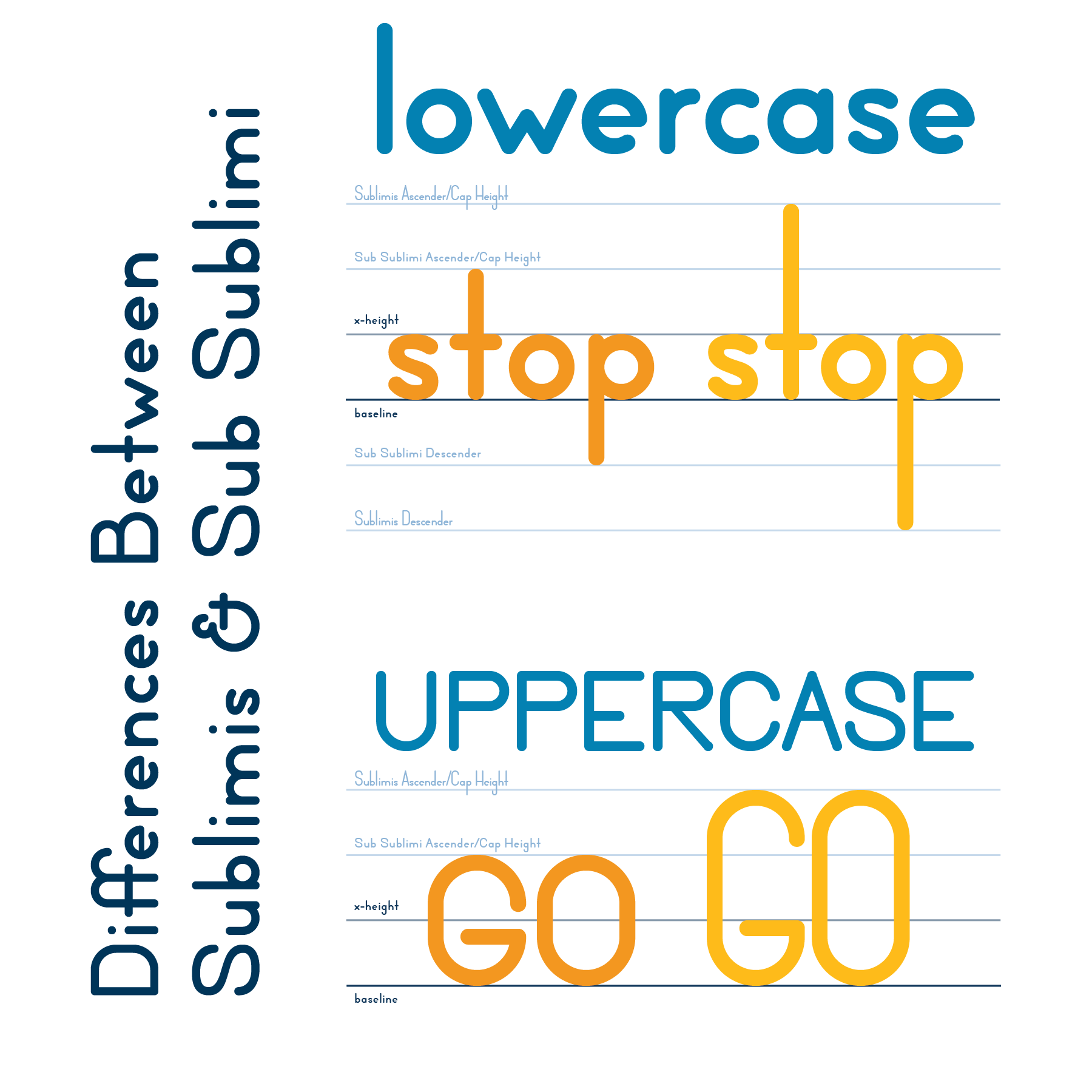
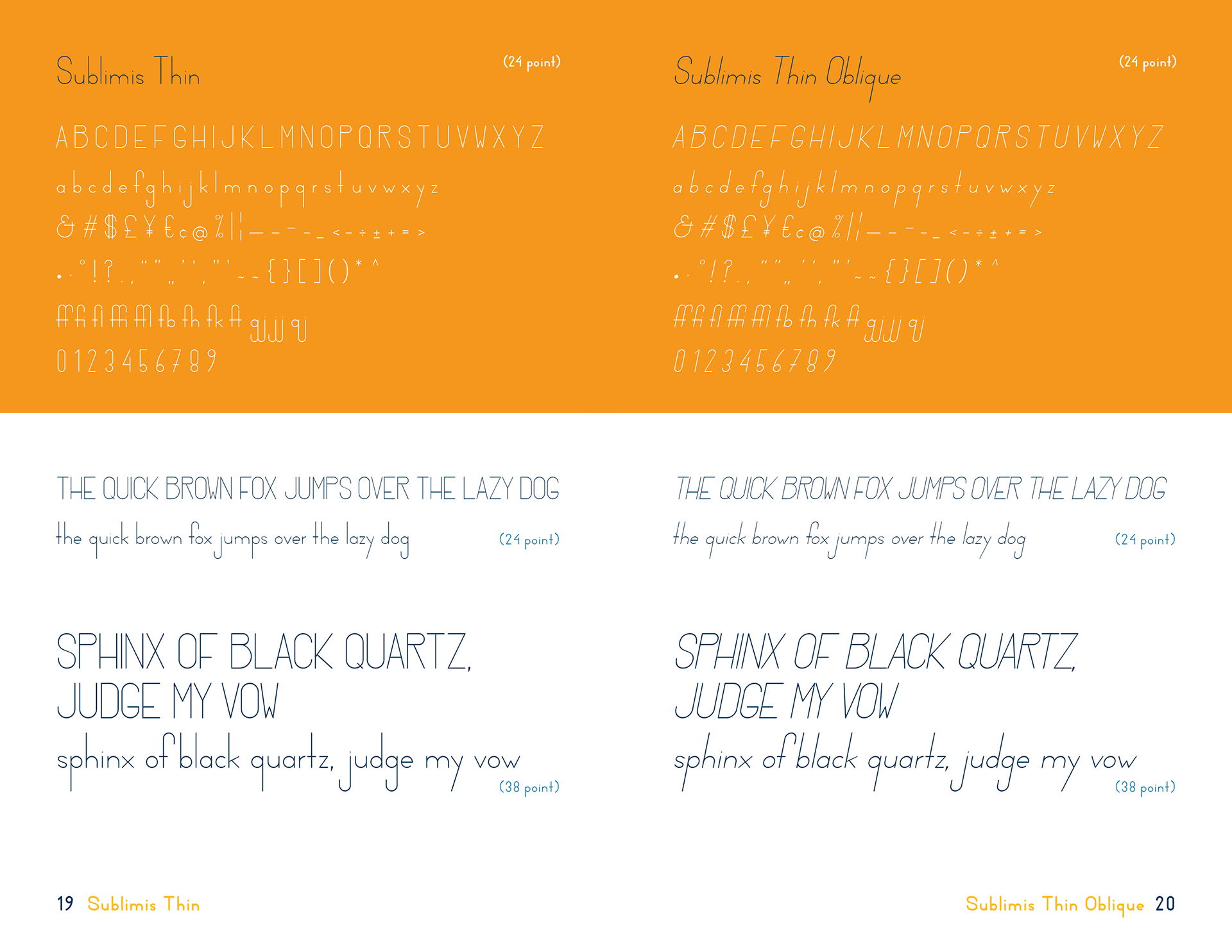
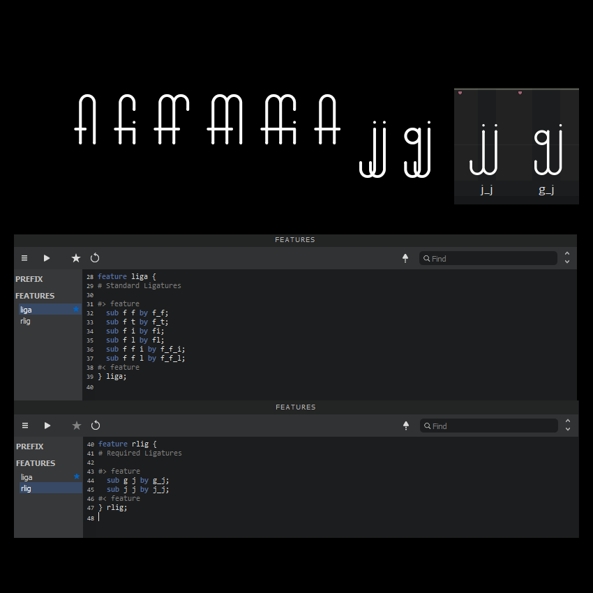
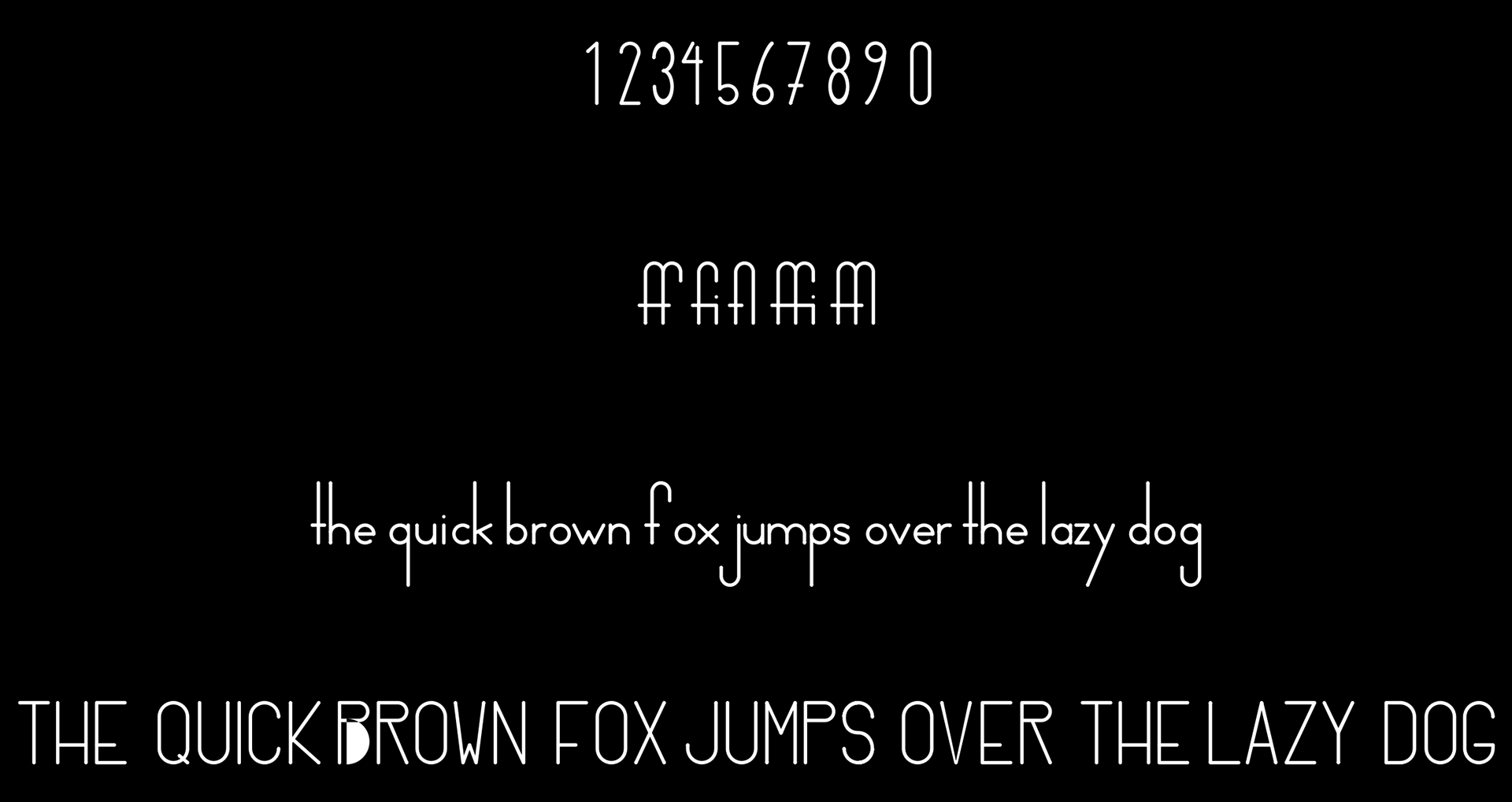
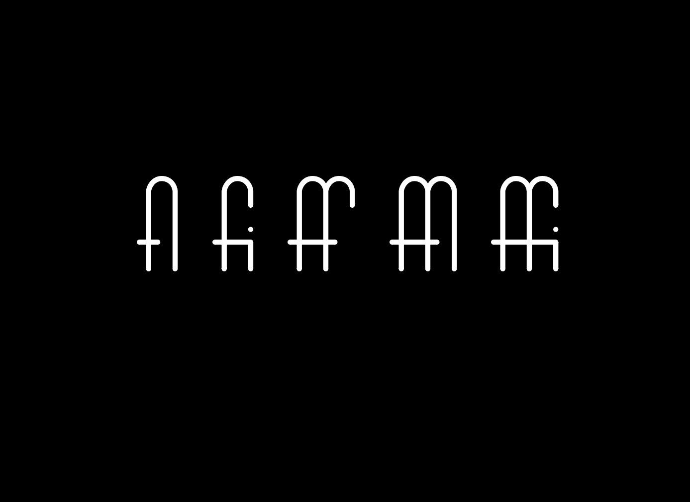
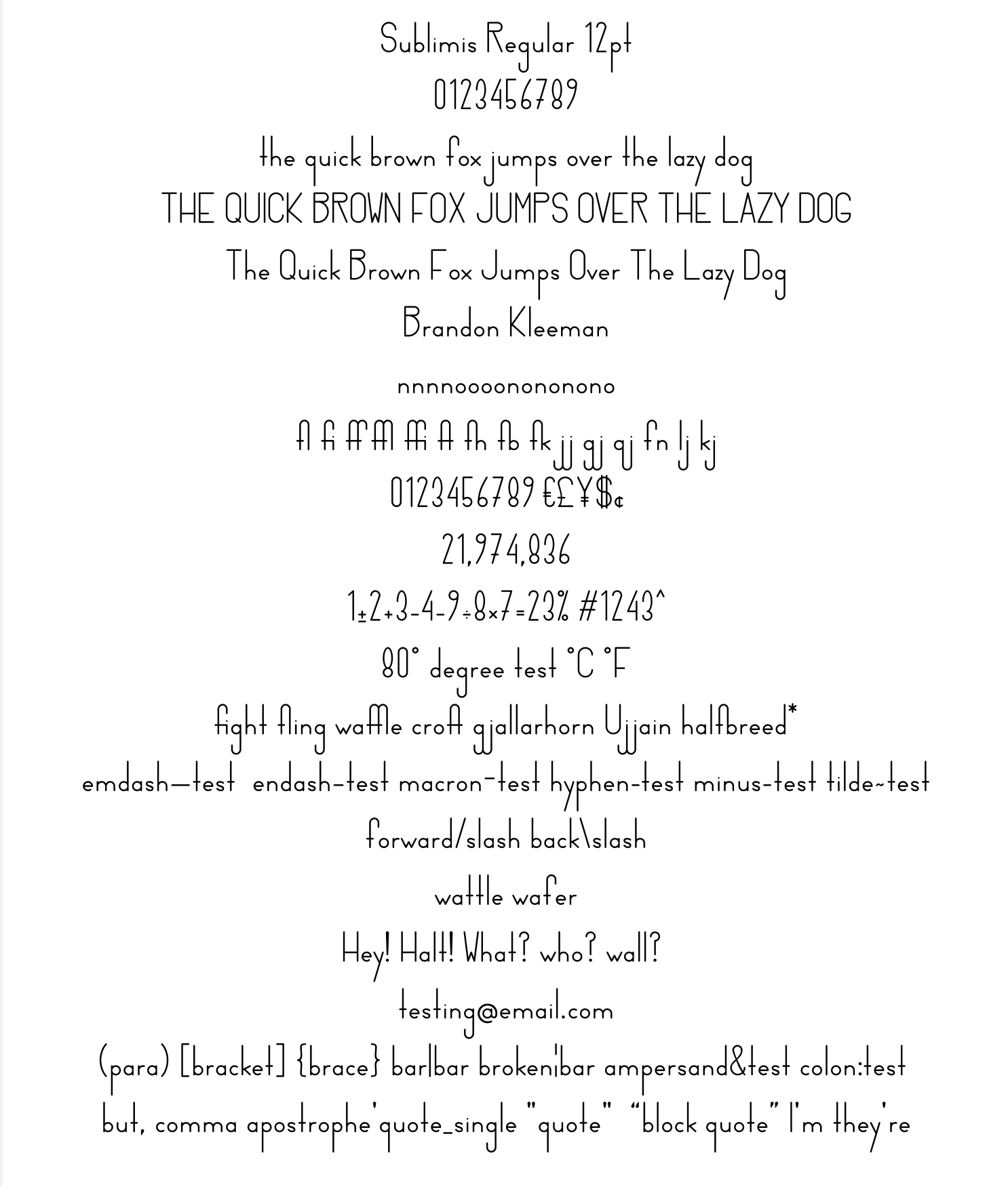
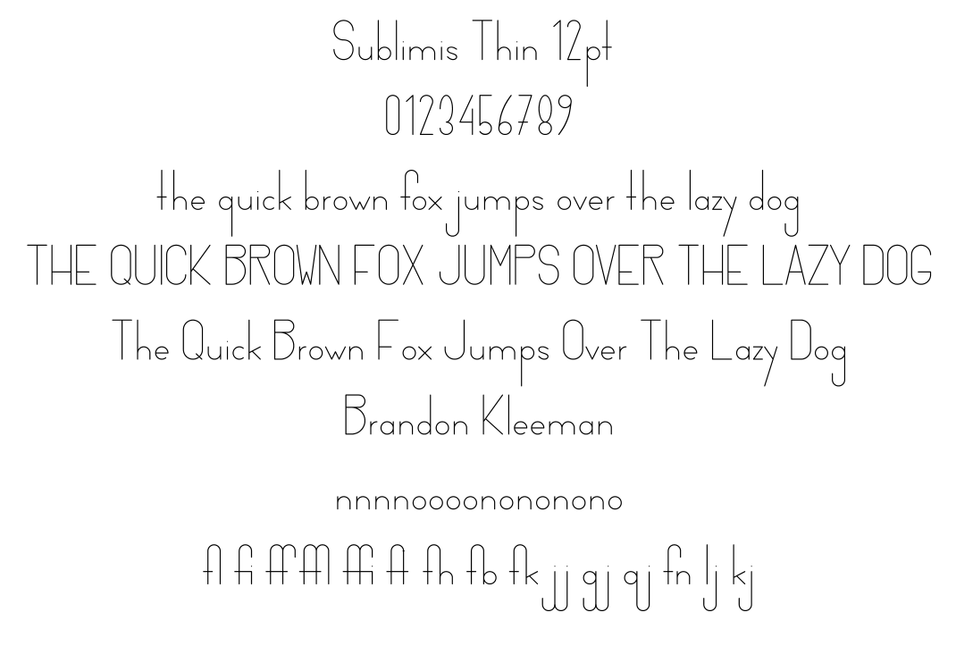
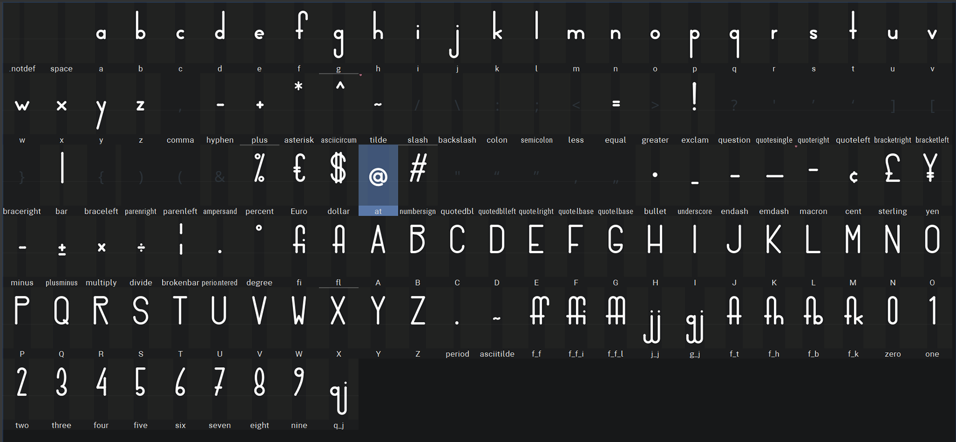
Sublimis:
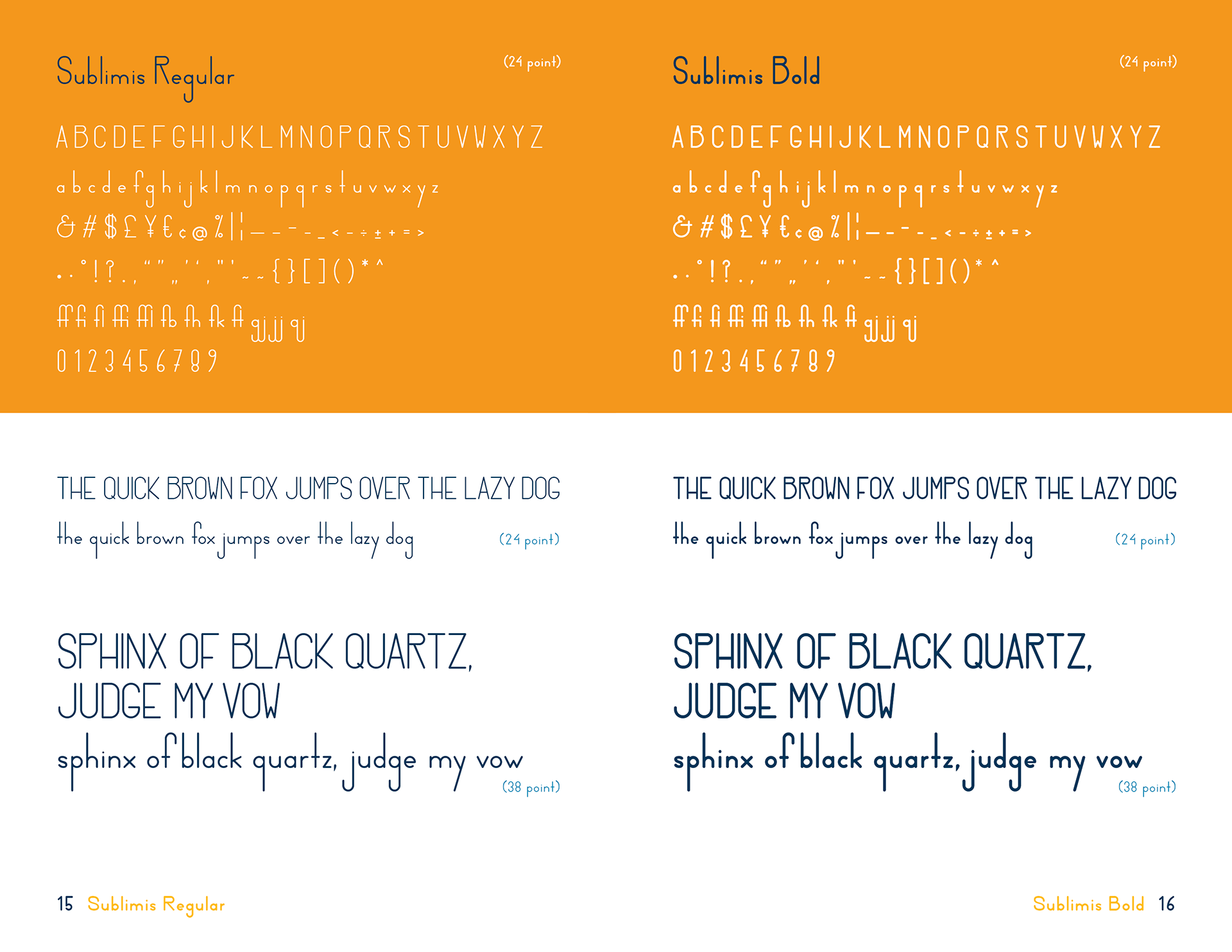
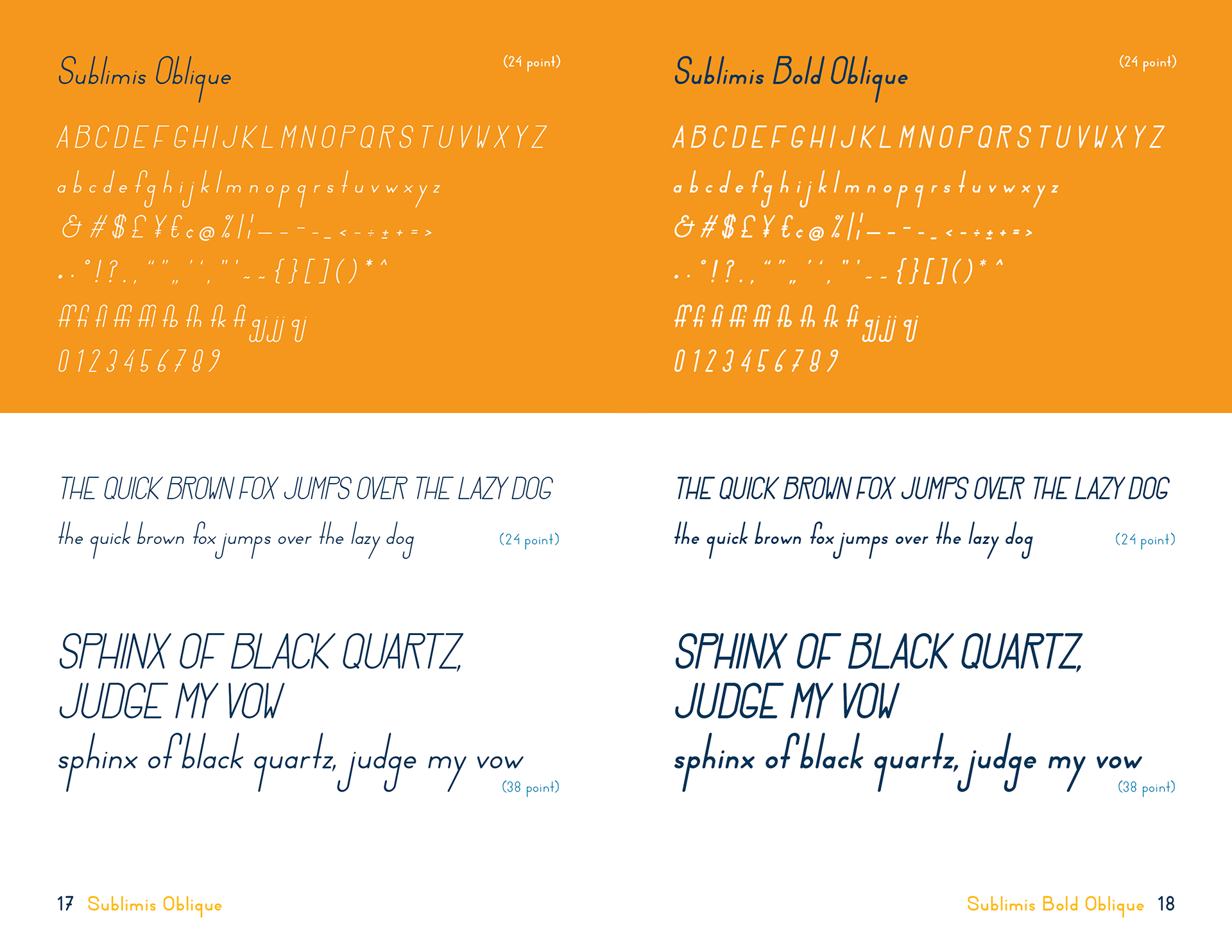
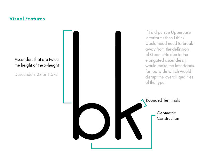
A geometric sans serif display font family. It features elongated ascenders and descenders and rounded terminals.
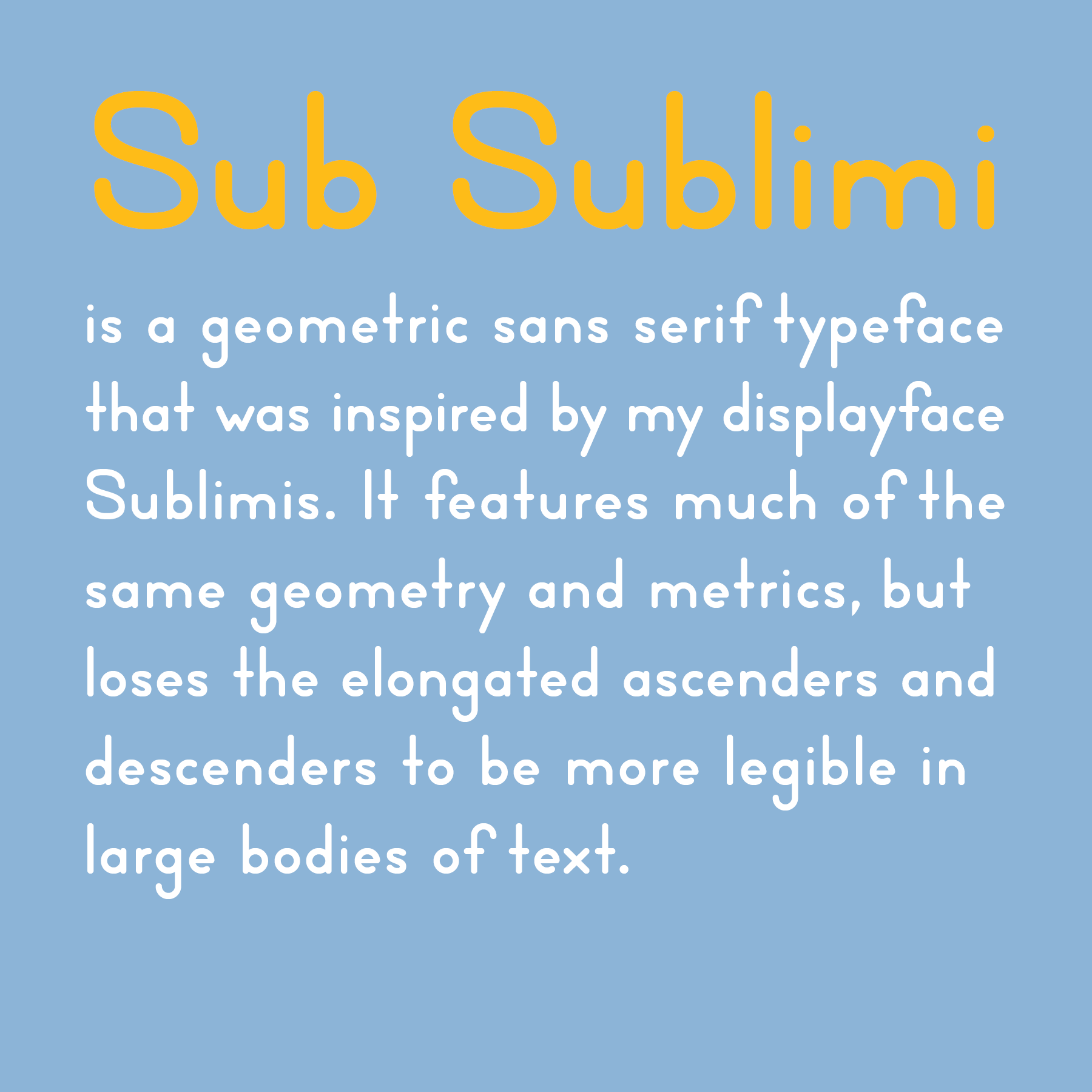
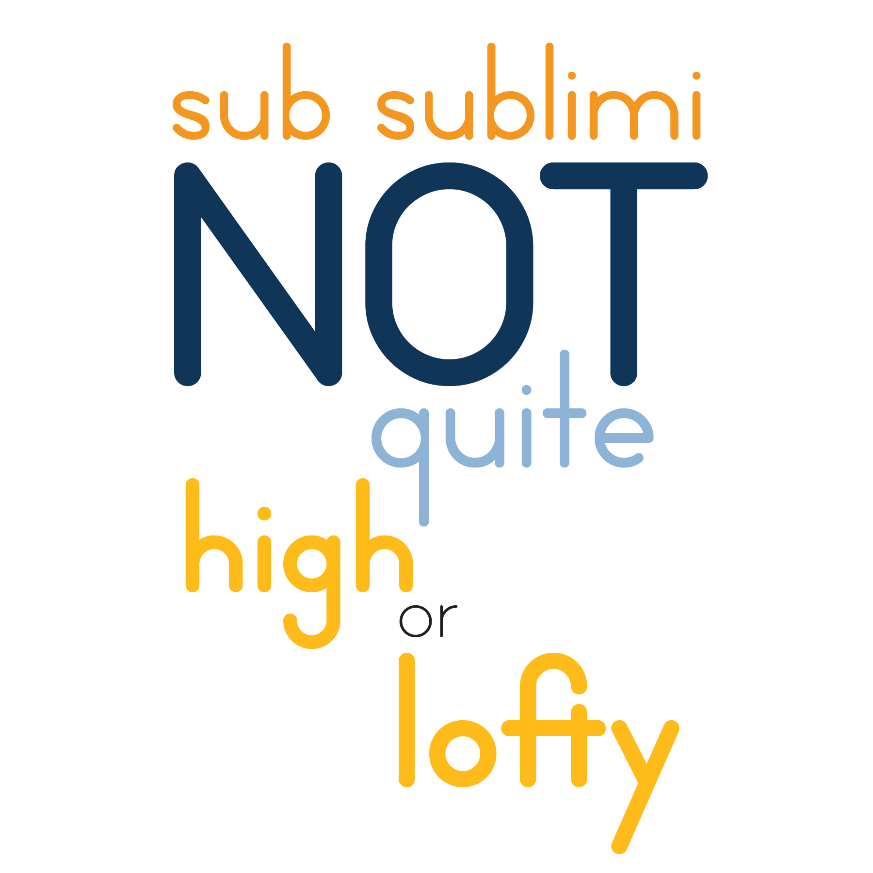
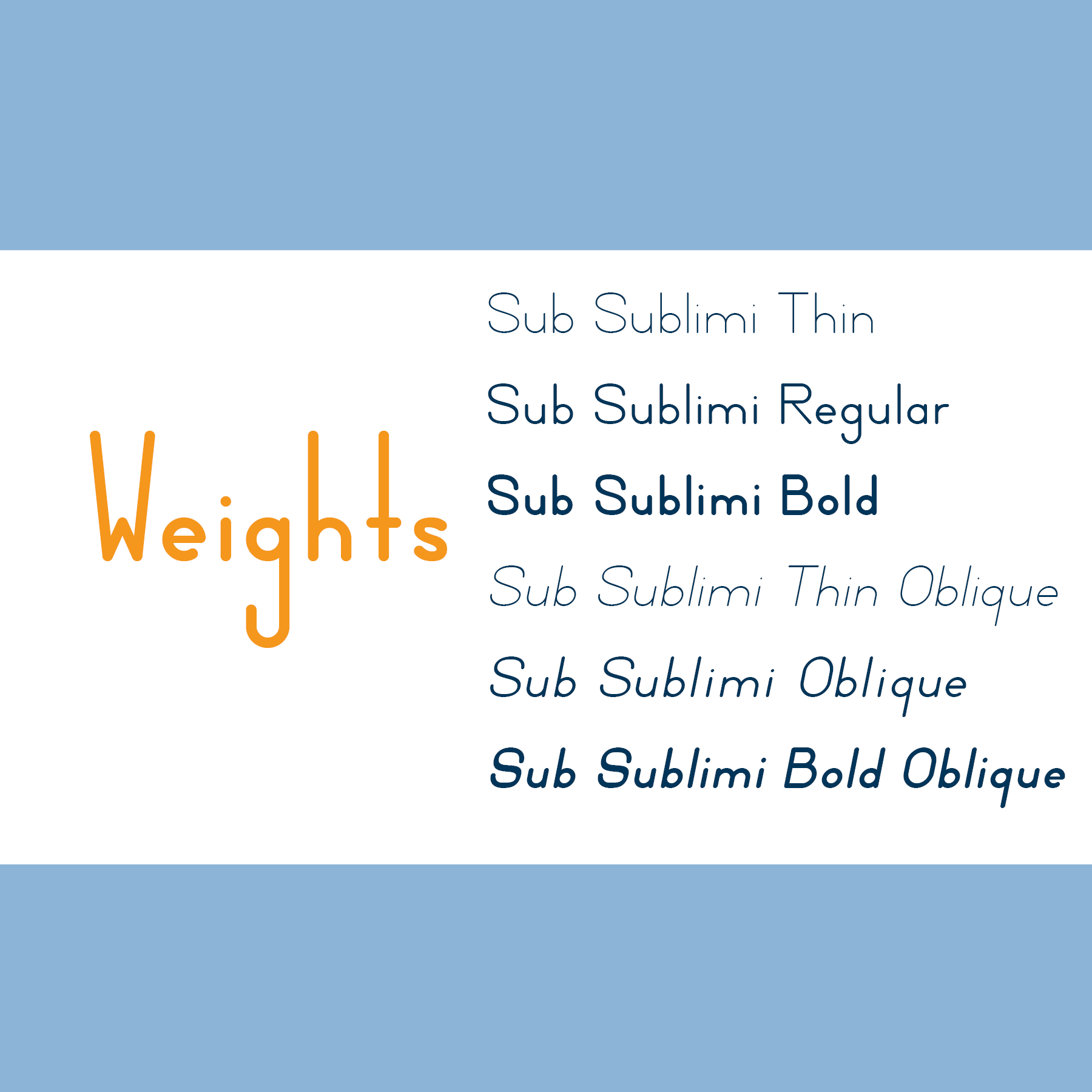
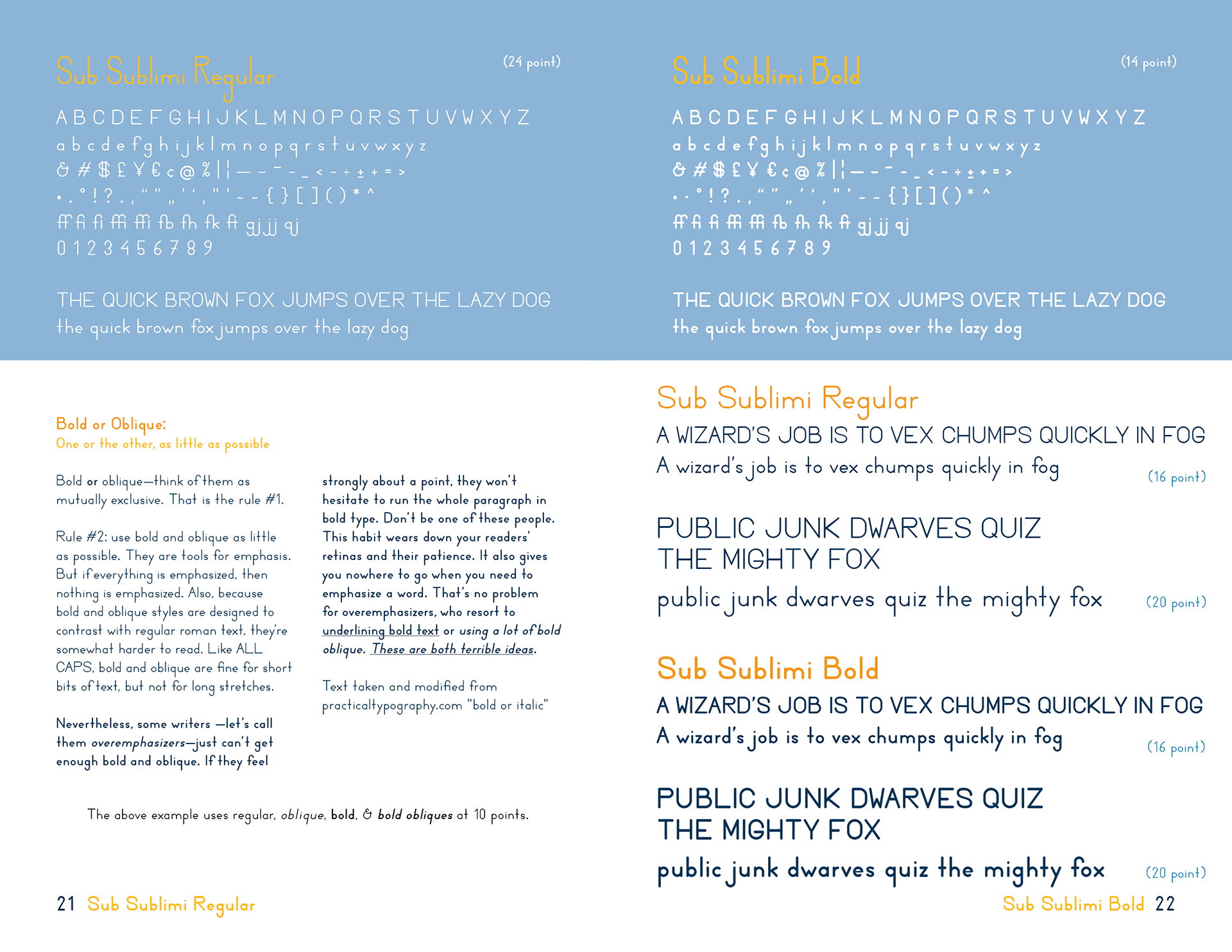
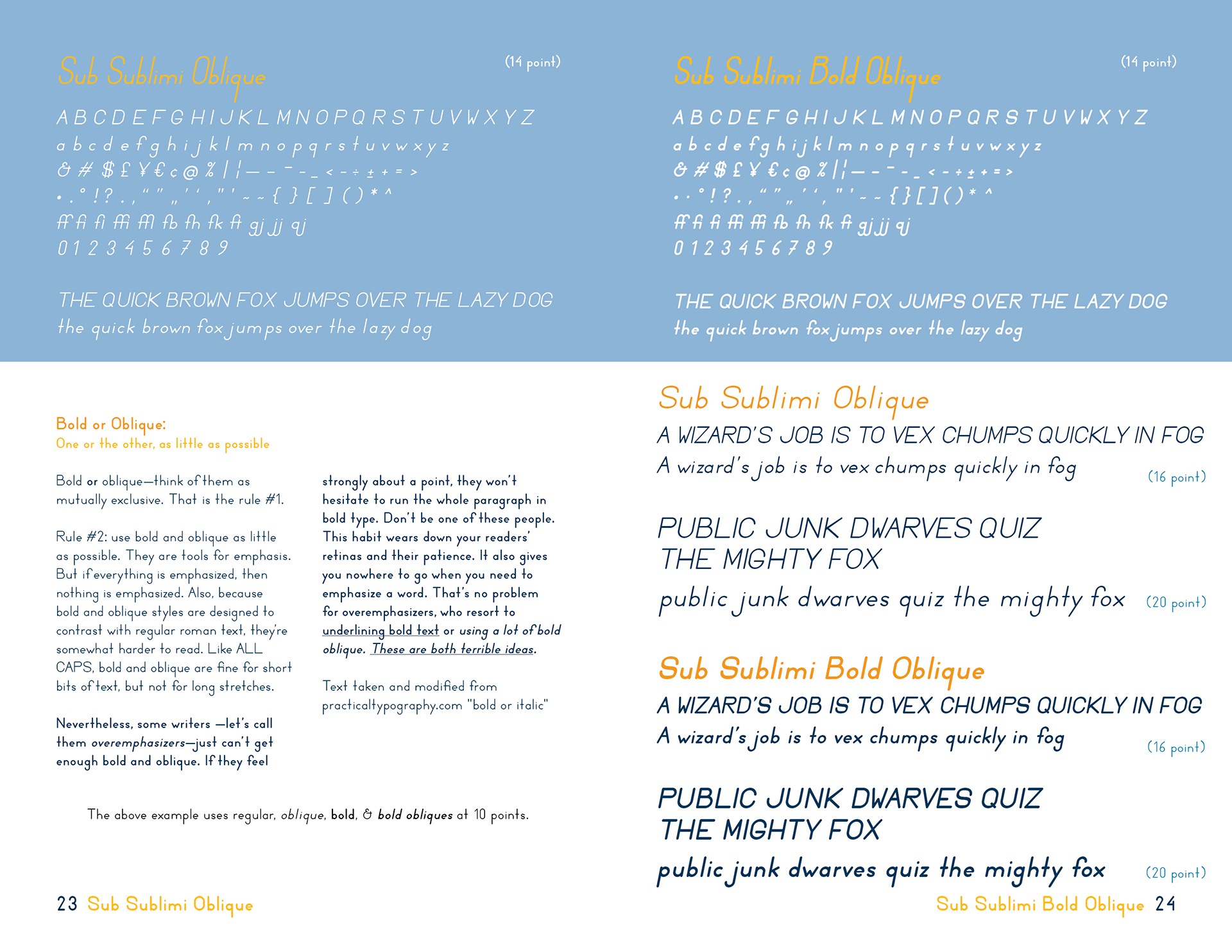
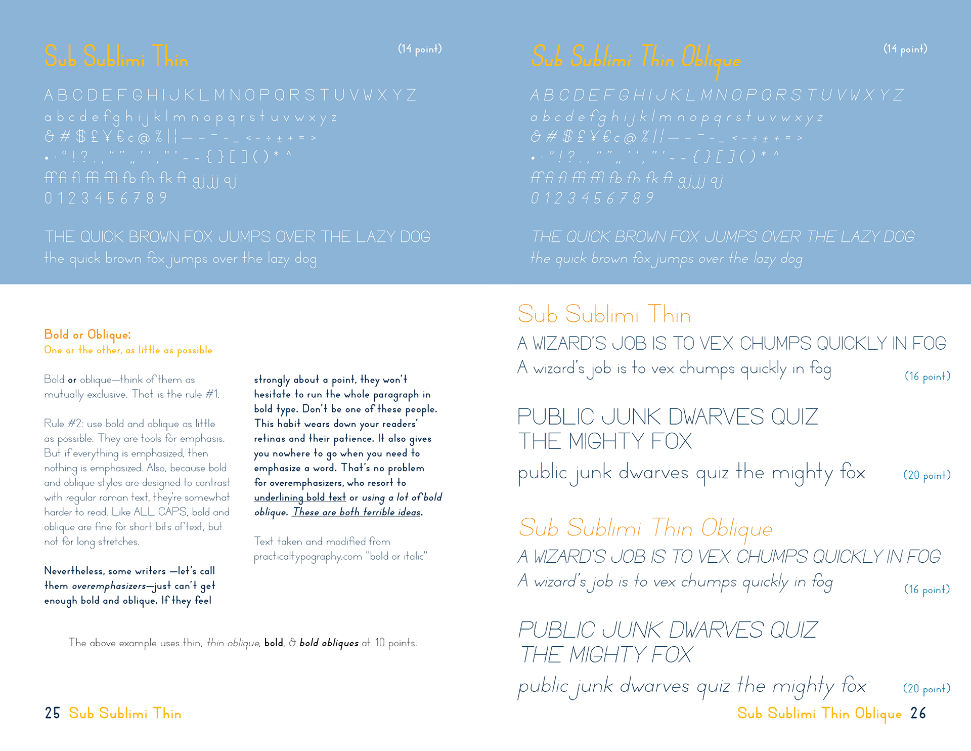
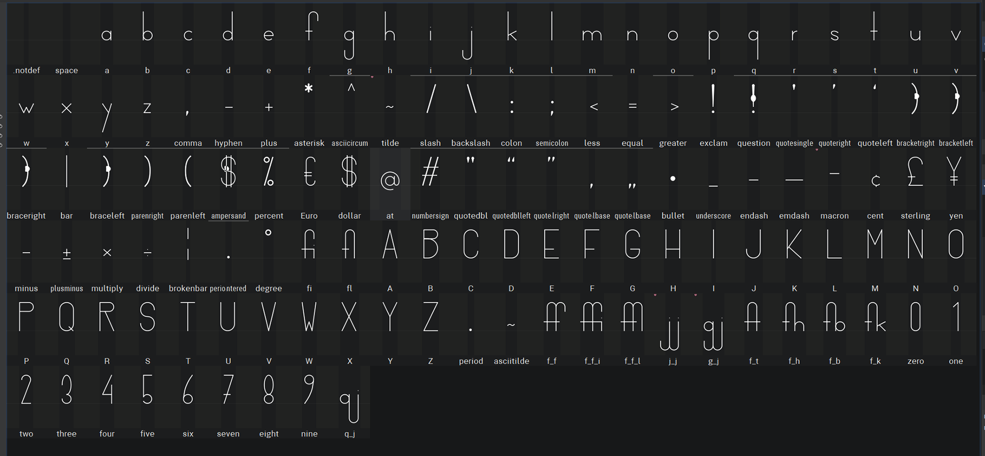
Sub Sublimi:
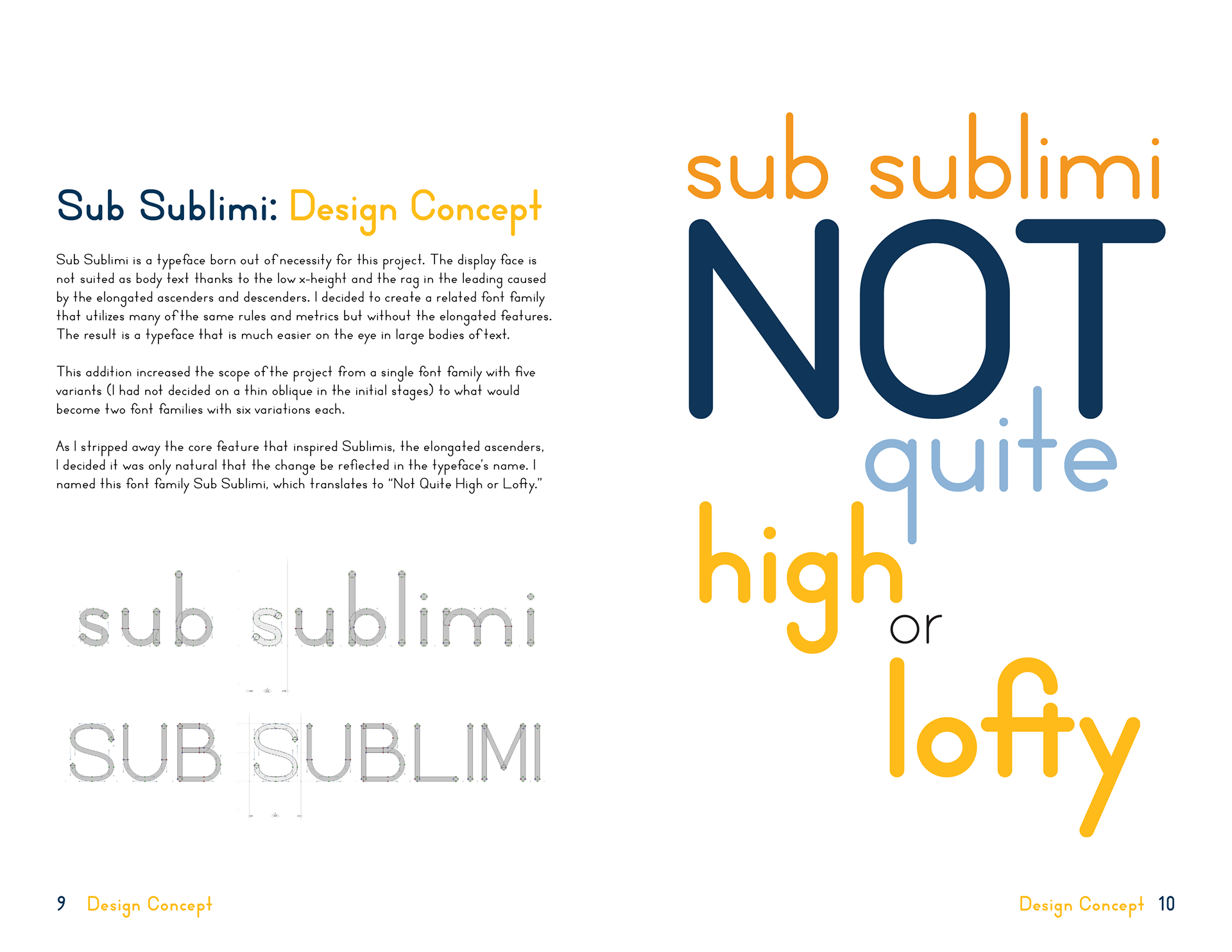
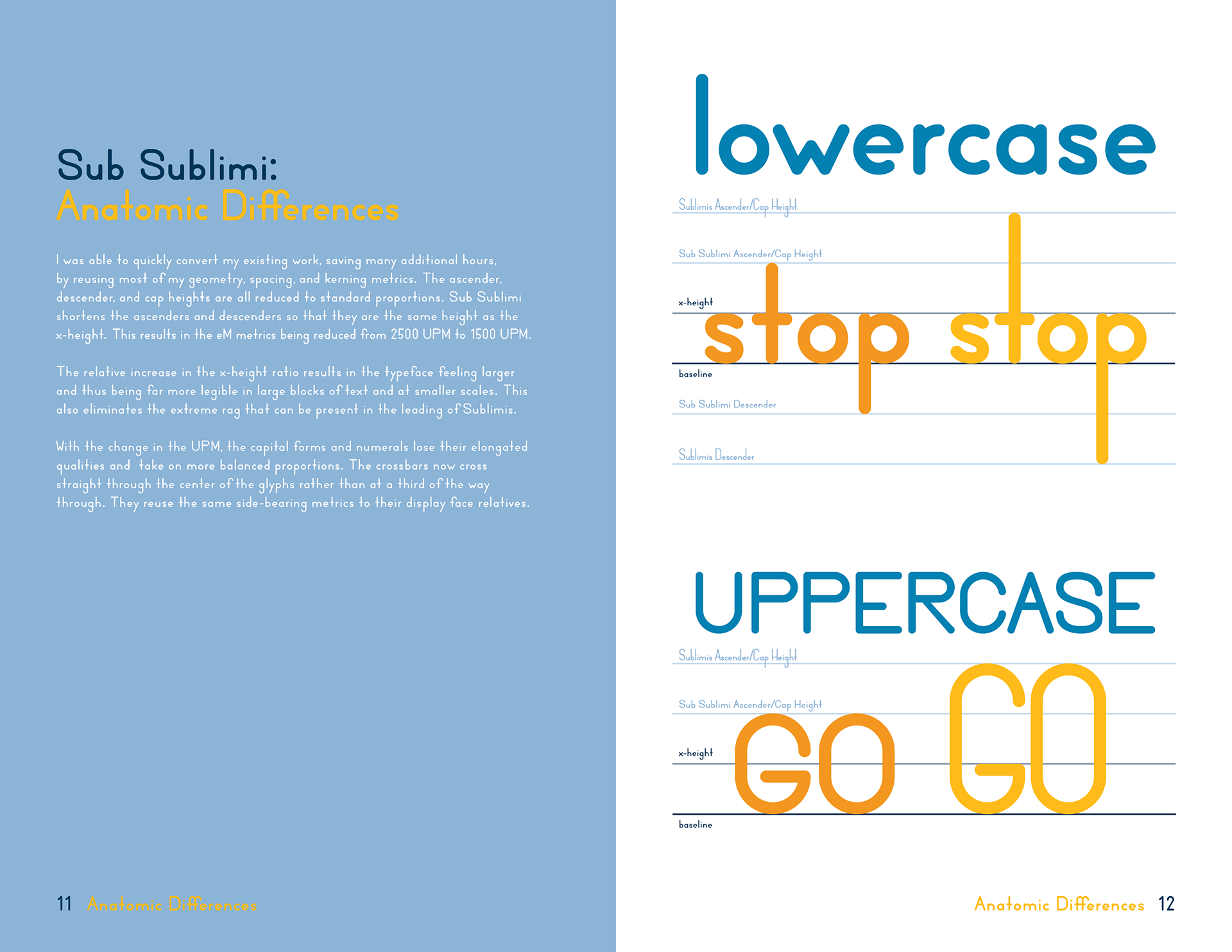
A geometric sans serif font family that utilizes much of the same geometry and metrics as Sublimis. This family lacks the elongated features that inspired the original and is optimized for legibility in large bodies of text.
A geometric sans serif display font family. It features elongated ascenders and descenders and rounded terminals.
Sub Sublimi:
A geometric sans serif font family that utilizes much of the same geometry and metrics as Sublimis. This family lacks the elongated features that inspired the original and is optimized for legibility in large bodies of text.
Software Used
These fonts were designed in FontLab 8, an industry-leading font development software available on both Mac and Windows. I decided to use FontLab since the free and open-source FontForge has poor vector tools and the UI is both dated and not intuitive, which would increase the learning process for more advanced features. I avoided Glyphs which is another popular (and more affordable) font development tool as it was limited to Mac OS.
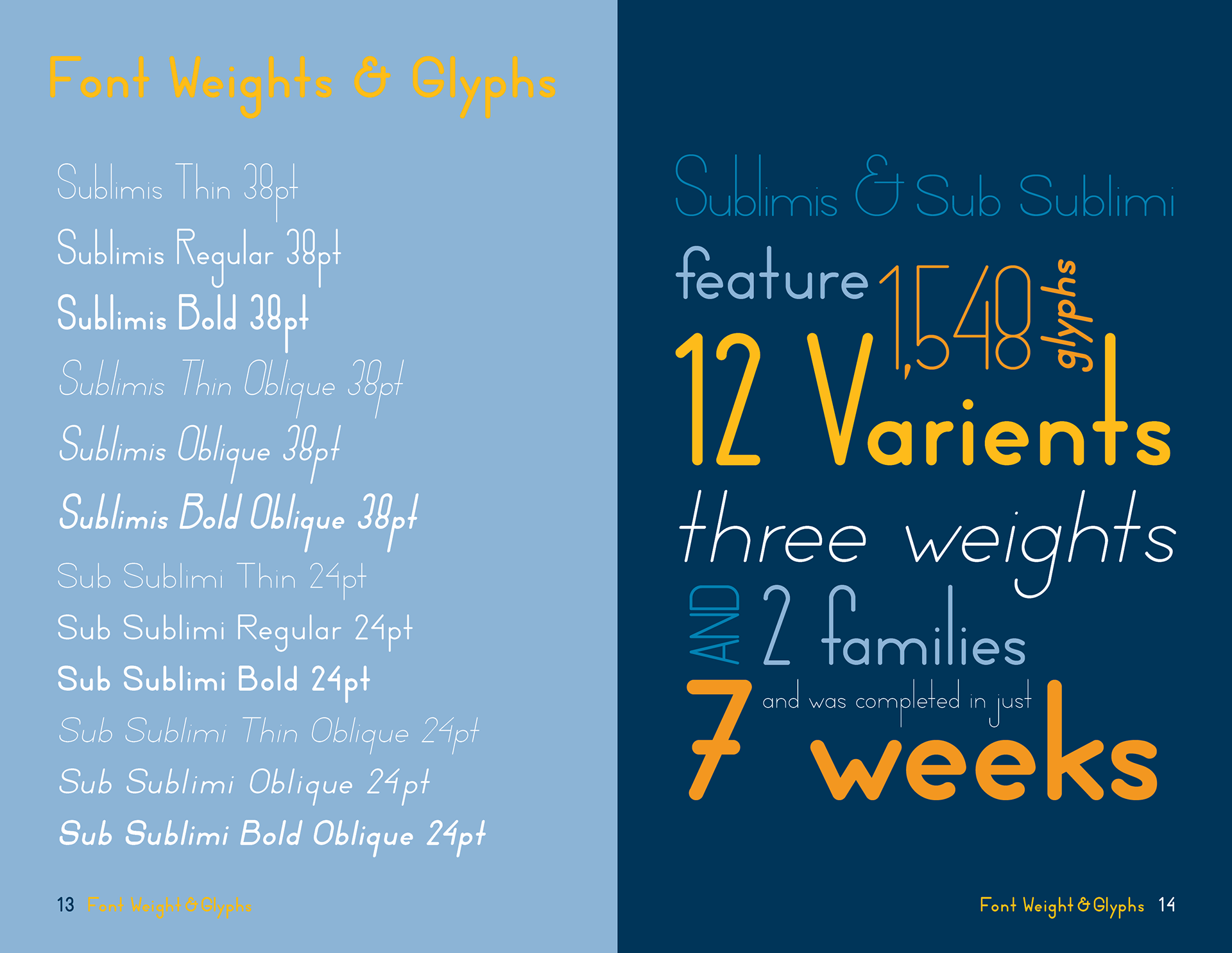
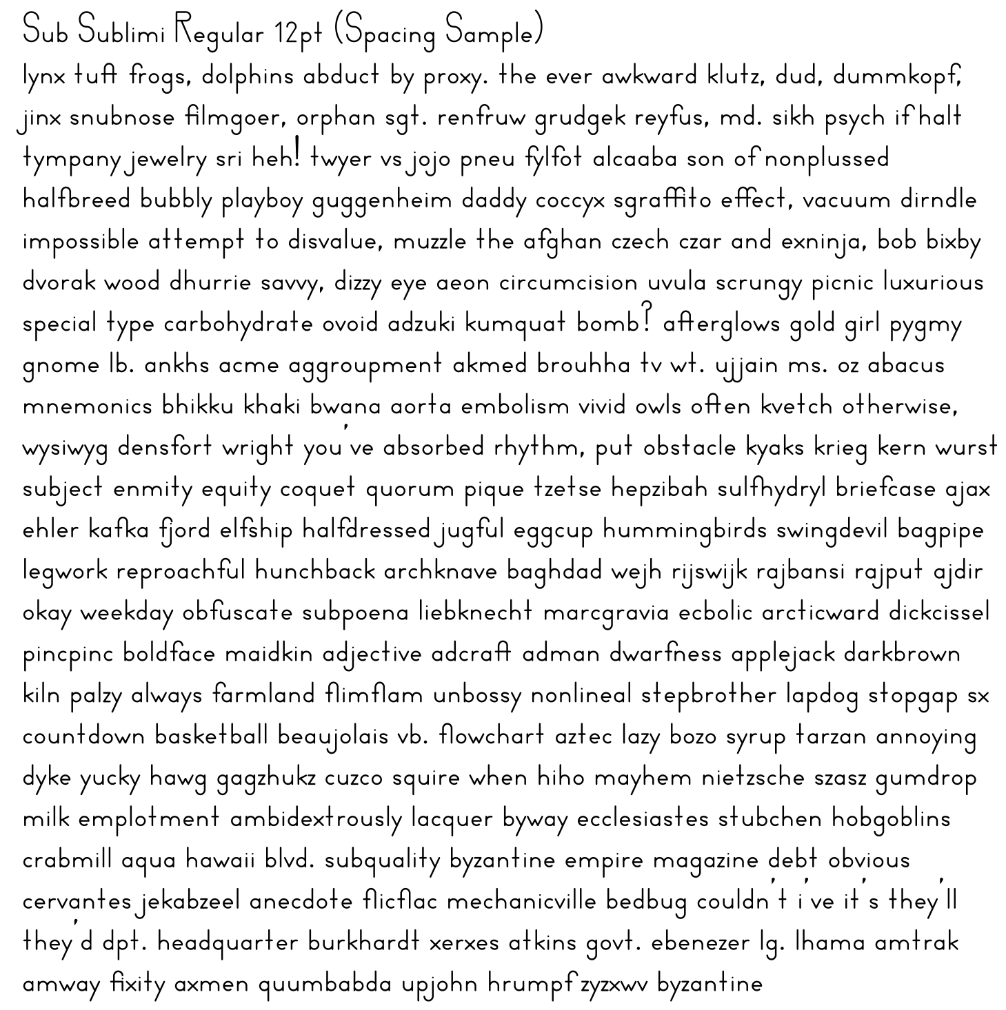
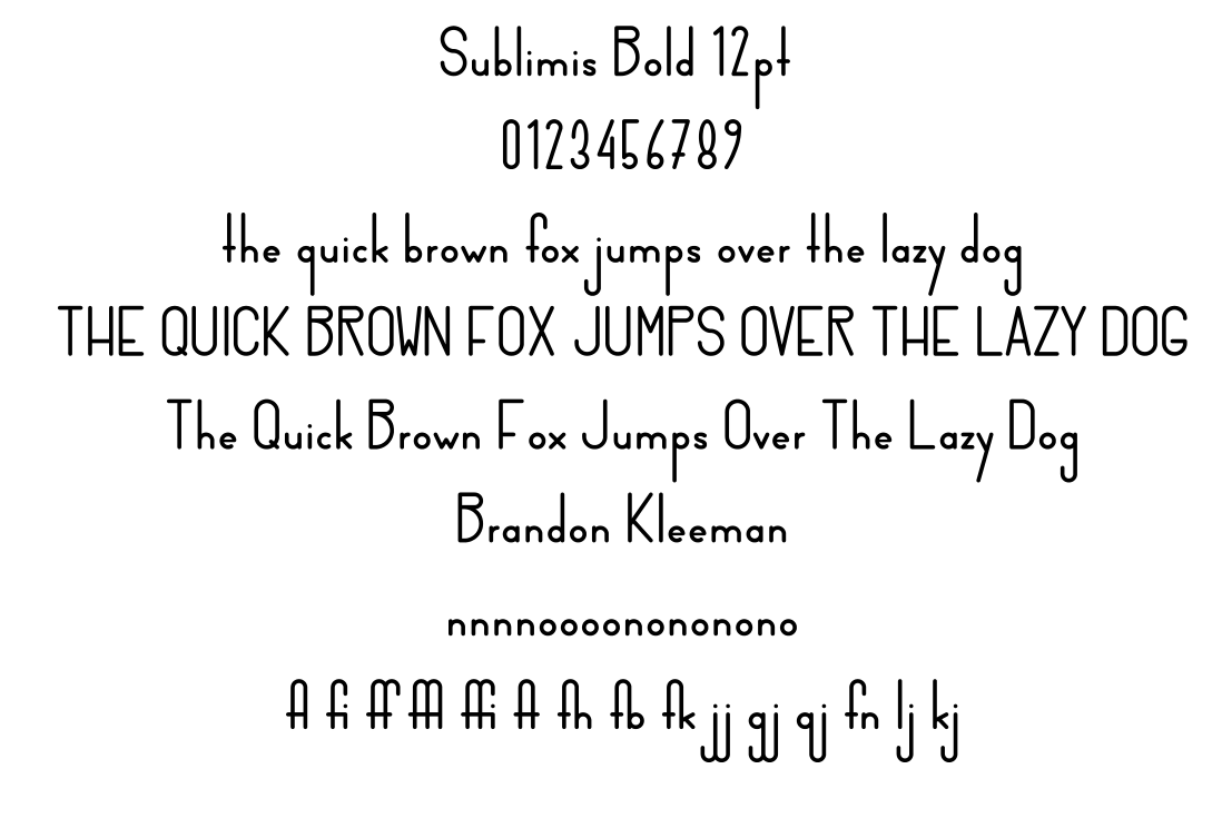
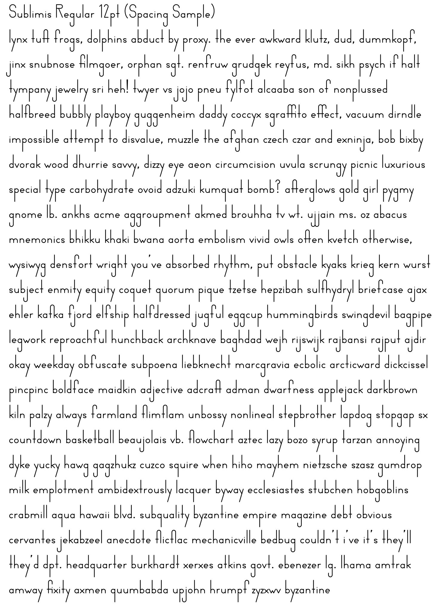
Sublimis
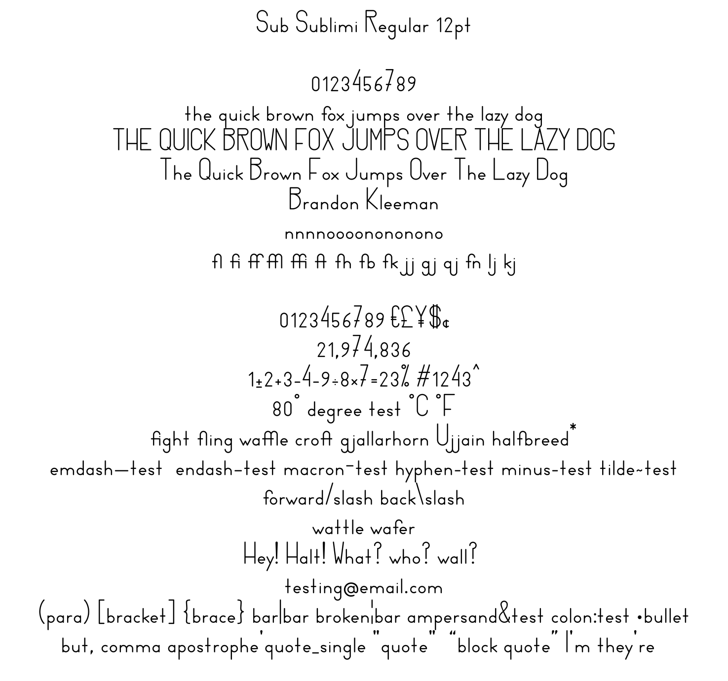
Sub Sublimi
Photos
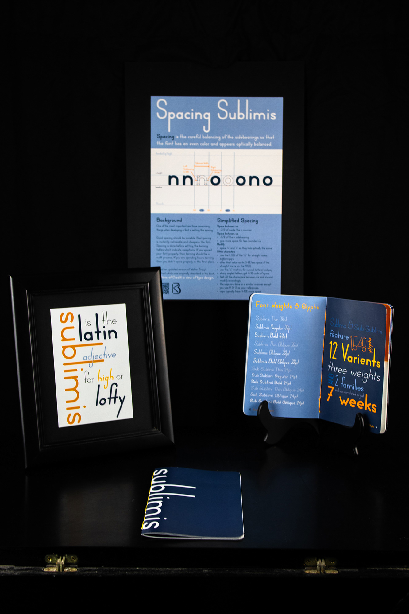
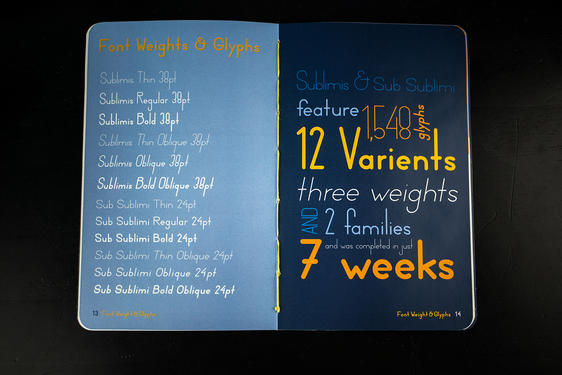
Specimen Book Spreads


Design Process
Initial Concept
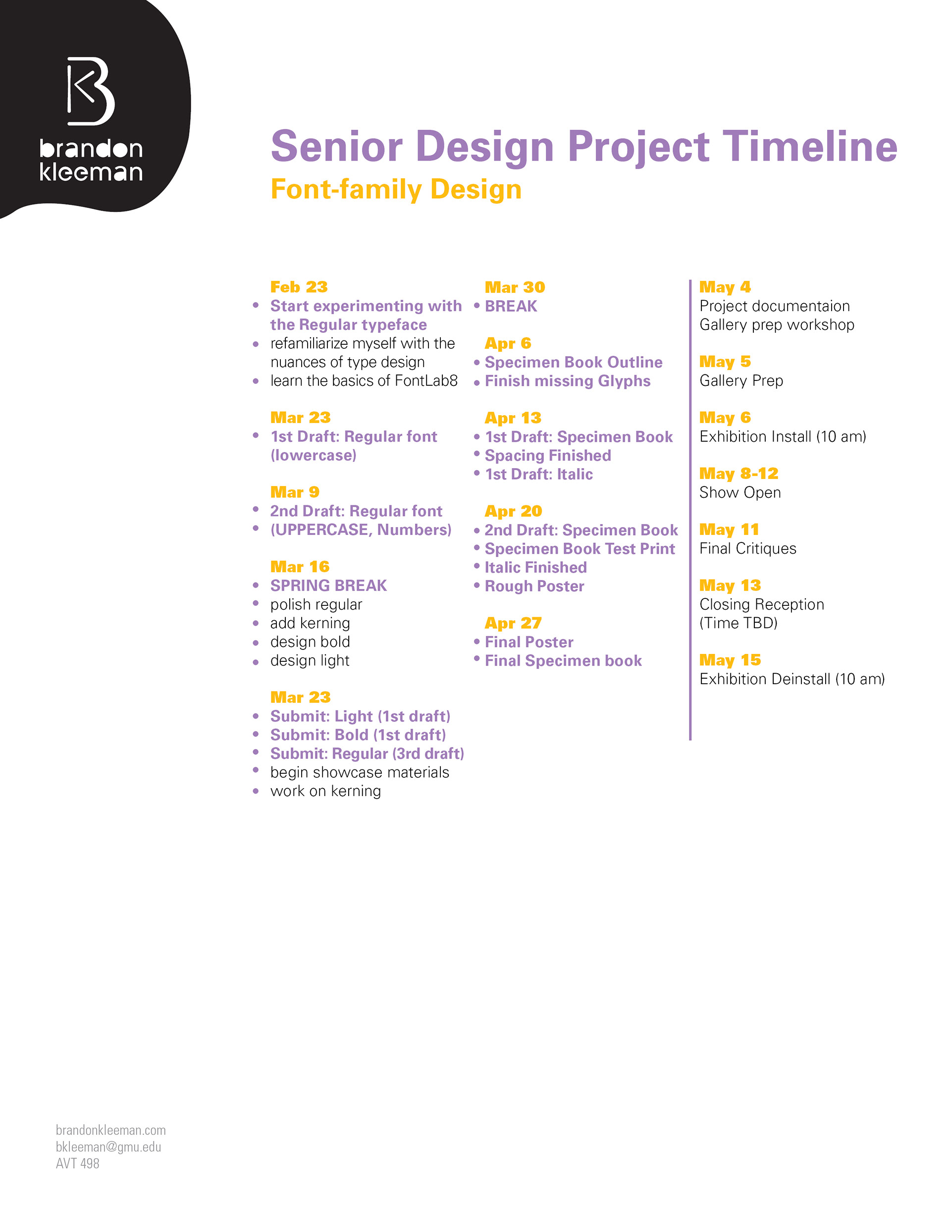
Project Timeline
Moodboard
Early Iterations
Phase 1
Phase 1
Phase 1
Phase 2
Phase 2
Phase 2
Phase 2
Phase 2
Phase 2
Phase 3
Phase 3
Phase 4
Future Plans for Sublimis
I plan to develop Sublimis further before I release the whole family.
1) I would like to add an additional heavier weight
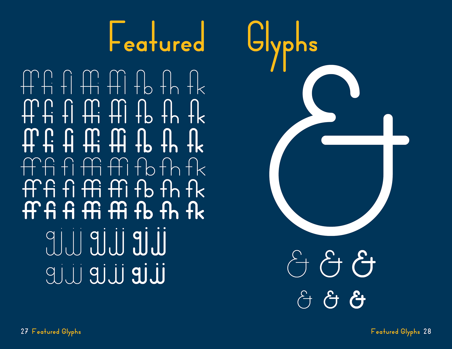
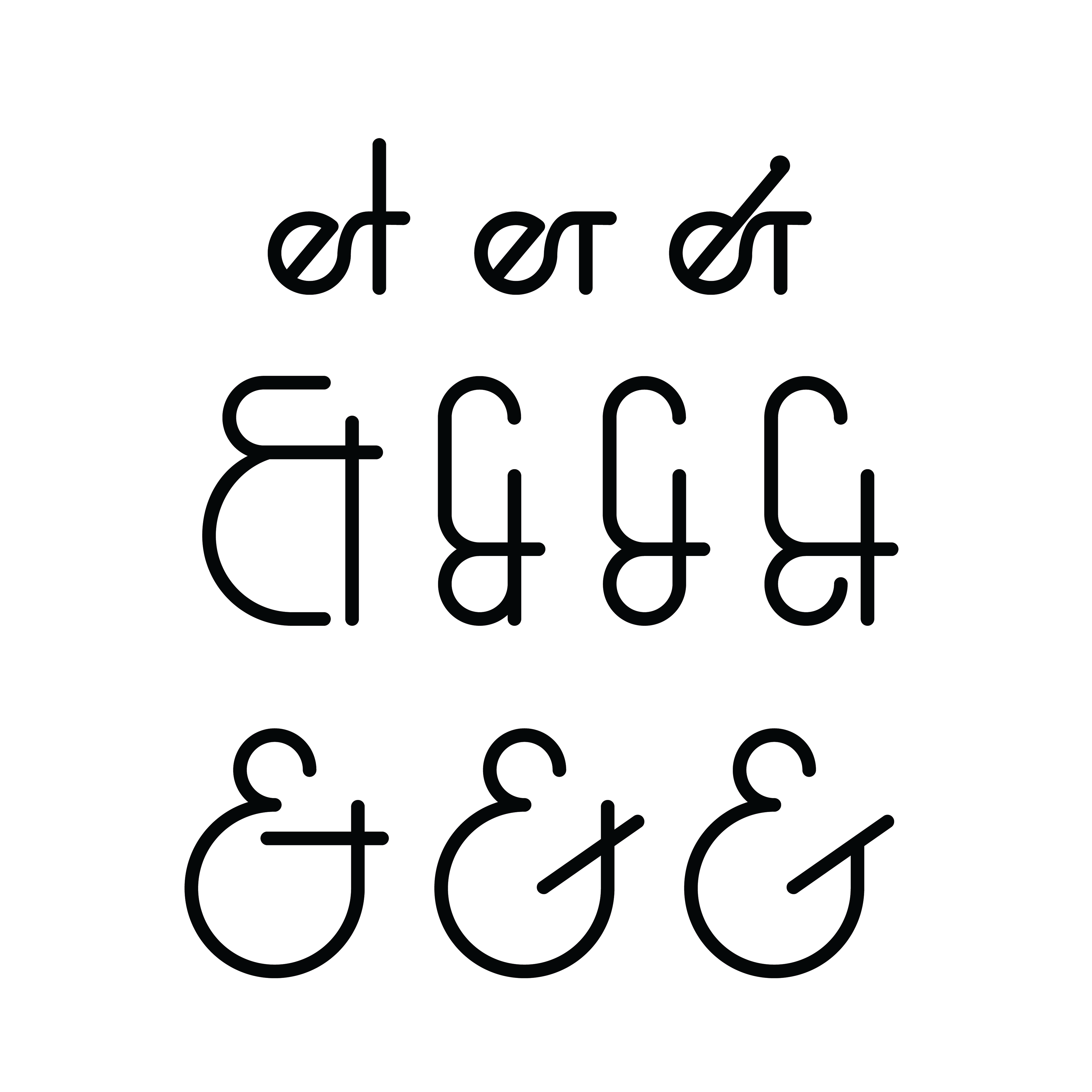
2) I would like to add a few additional glyphs including:
©, ™, fractions, alternate ampersands, and diacritic glyphs to support additional languages
©, ™, fractions, alternate ampersands, and diacritic glyphs to support additional languages
3) I would like to further refine the spacing of the glyphs
4) I would like to add kerning tables which I didn't add as I am still not 100% happy with the spacing metrics
5) I will consider adding any missing glyphs required to complete the closest standard character set
Once these changes are implemented I will release the font for sale and add a link to this page.
I expect this further refinement process to take at least a couple of months.
I expect this further refinement process to take at least a couple of months.